There are four reasons why I have enjoyed and highly recommend the Tyndale House GNT-ESV Diglot. (1) The Greek text is clean and a pleasure to read, (2) the amount of Greek text on the page — due to the more focused apparatus, in comparison with the NA and UBS texts — makes it easy to track with the flow of thought. (3) Having the ESV text on the facing page makes it even easier to quickly skim multiple chapters for the flow of thought in a book. (4) It’s also ideal for travel because it’s personal-sized and the nature of a diglot means you don’t need to reference a digital lexicon as frequently.
Ideal for Travel
Every time I travel, one of the biggest packing frustrations is trying to decide which Bibles to take. That might sound absurd to some, but I would think that if you are reading this post, you probably understand! This edition of the THGNT uses slightly thinner paper in comparison with the standard edition. This means that even though this edition is a diglot, it’s still not much bigger than the standard edition.
Furthermore, a diglot is ideal for reading on a plane. On a plane, there just isn’t enough room for multiple print books. Having English on the facing page means you can get help with rare words and keep reading Greek.
Skimming English for Flow
I frequently want to skim back through the last couple chapters I have read and take notes on the flow of thought. Having a translation with pericope headings makes this easy. Being able to skim through multiple chapters quickly is really helpful.
Amount of Greek on One Page
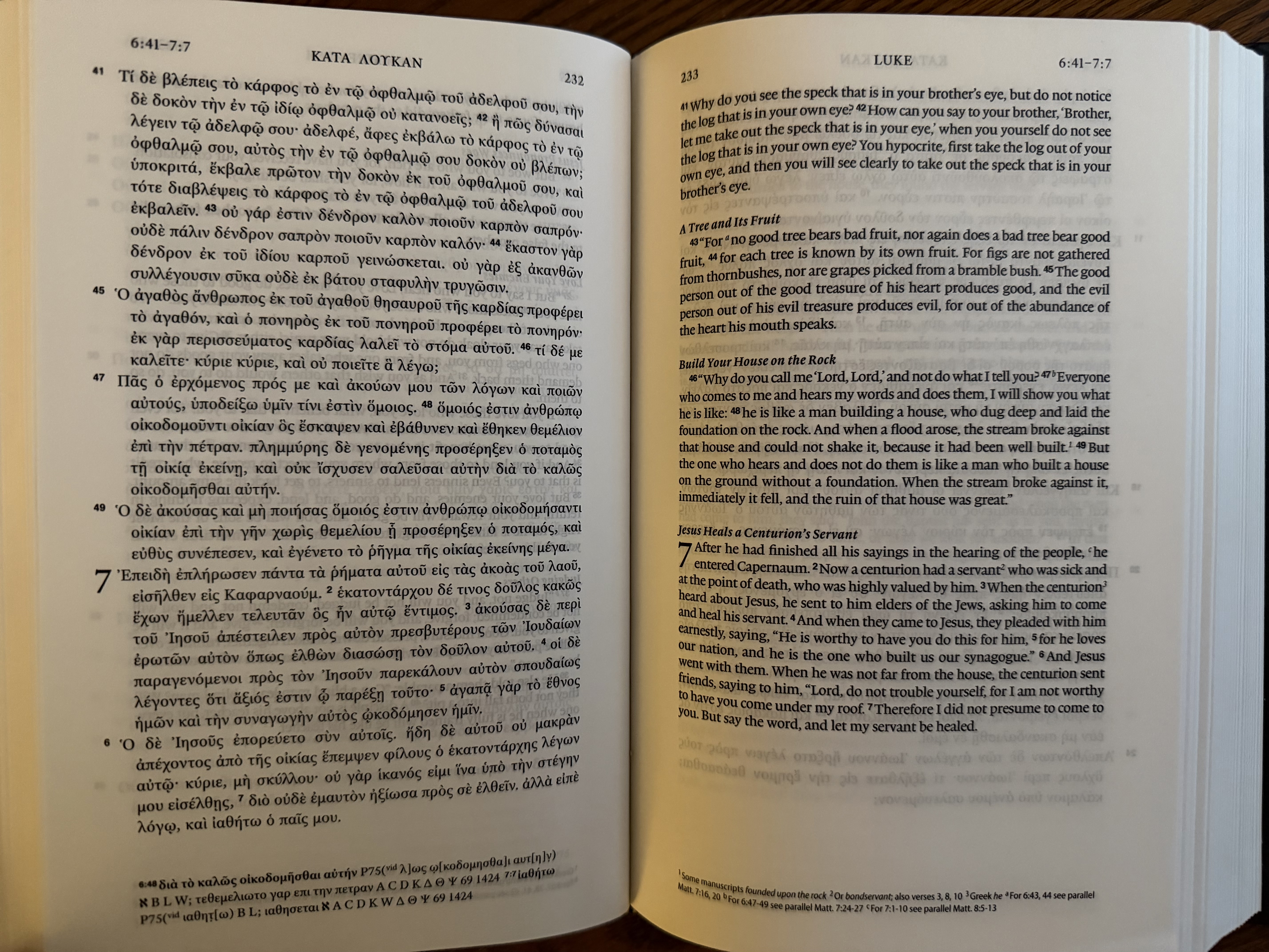
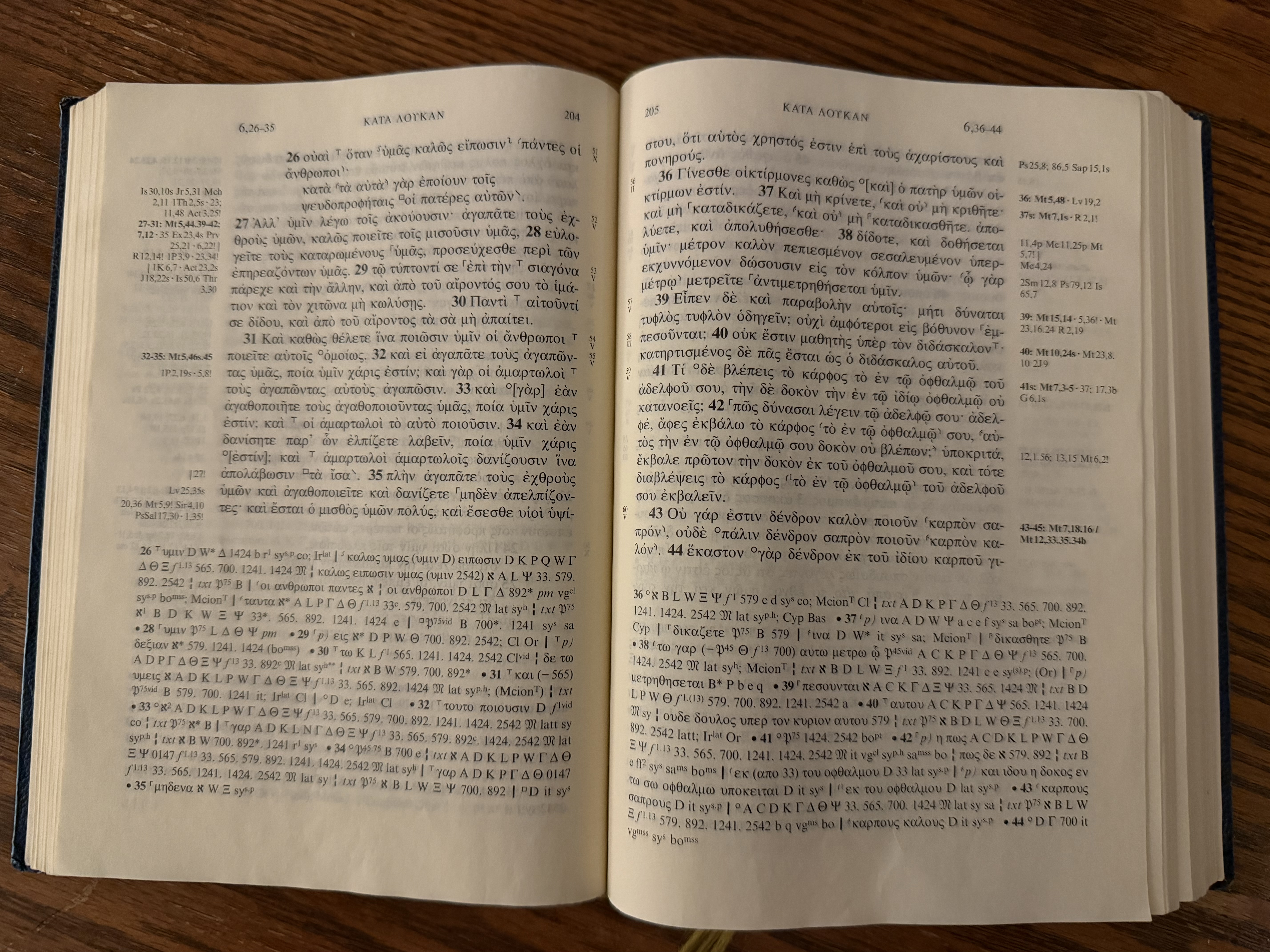
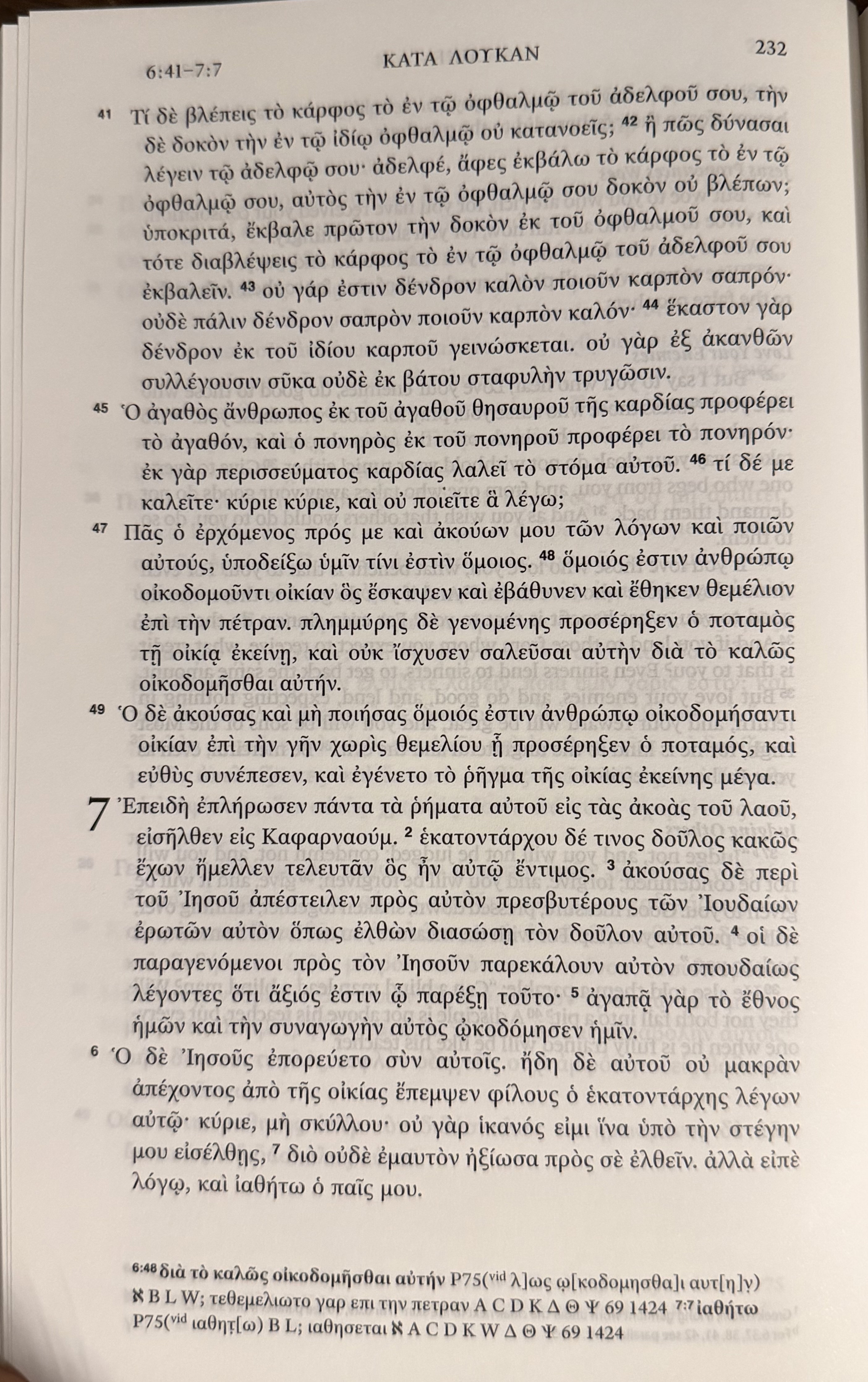
Even though you can only look at one page of Greek at a time in a diglot, the amount of Greek on a given page in this edition is remarkable compared to other critical editions like NA28. This is a big deal when it comes to tracking flow of thought. Compare the picture above with NA28 below:
Clarity of Greek Text
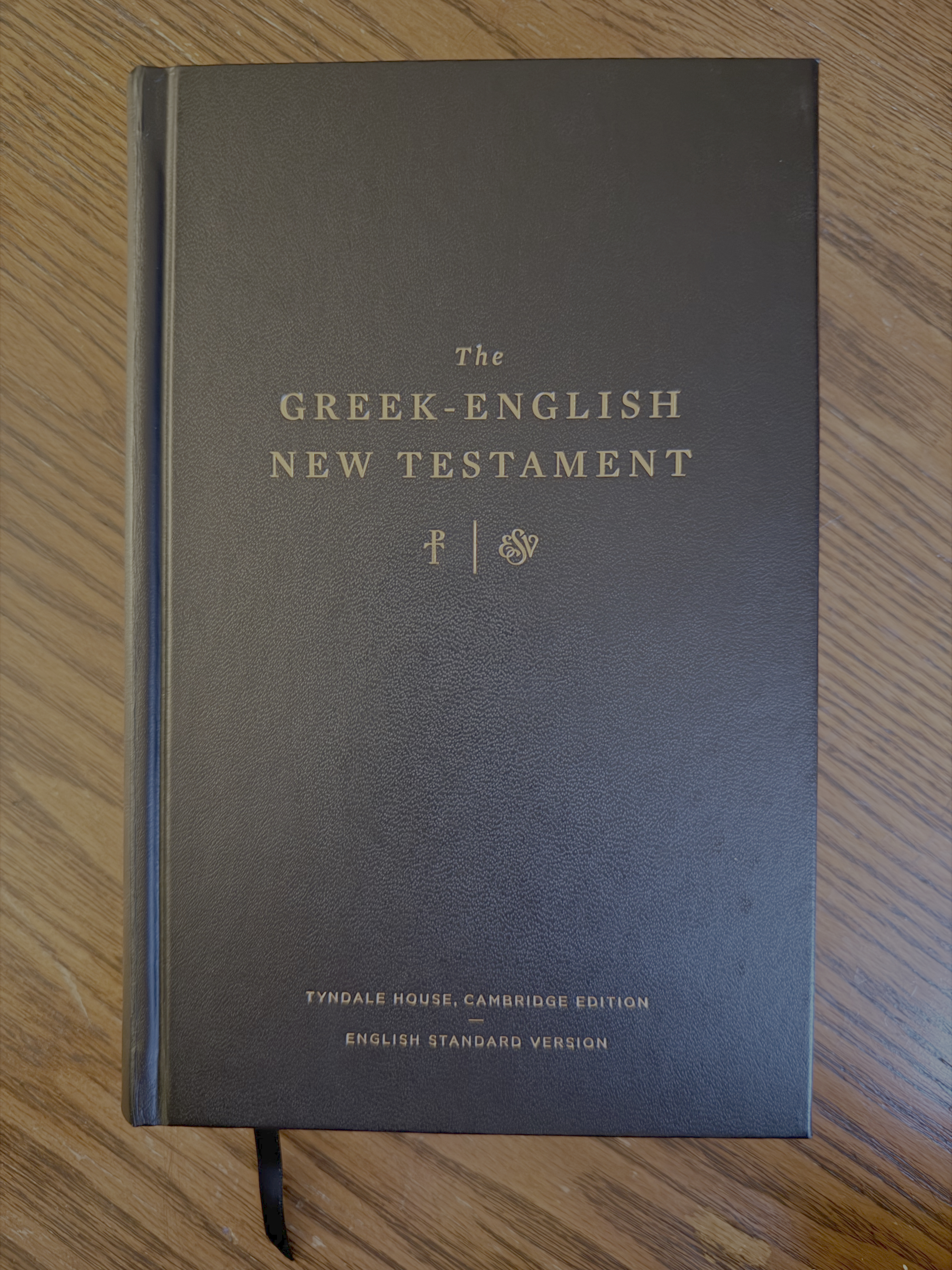
Finally, since it’s release in 2017, the THGNT has been my favorite Greek New Testament in part because of the beauty of the font and the page layout. I trust the scholars behind this edition and the methodology is sound — that’s really important, too. But if they made an ugly GNT, I wouldn’t read it. There’s other options! Thankfully, that’s not the case. The Adobe Greek font, the use of ekthesis, the simple apparatus, the comfortable margin, the paper quality, the cover and the clean aesthetics — it’s just a beautiful edition.
Conclusion
I really enjoy the THGNT-ESV diglot because it’s a beautiful edition that is easy to read and skim for flow of thought. It’s ideal for traveling, and I highly recommend it.

Leave a comment