Accordance has a new unicode font in the works. It includes characters for English, Greek, Hebrew, Syriac, and more — even DSS transcription like you see listed here. And it includes bold, italic, and bold-italic.
They announced this on the Accordance forums. Unfortunately you need a forums account to see the page.
Here are a couple words I typed in Mellel:
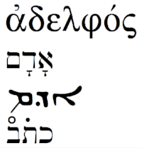
Now if that qamets would just slide a bit to the right underneath the daleth, like this אָדָם.
I’m particularly impressed with the fact that all the different language characters are sized appropriately (no gigantic Hebrew and Syriac in comparison to English and Greek):

Here is a PDF where you can see more of the characters included.

7 responses to “Accordance Unicode Font”
I guess one person’s “gigantic Hebrew” is another person’s “just right.” The Hebrew in your second to last blog post line doesn’t read a little small to you? Or is there something like a more objective standard I’m not aware of?
There is a standard. It’s just that hardly anyone follows it. Capital letters in English and letters like lower case “b” extend “above the line.” Think kindergarten writing lines. Hebrew letters like he and het and aleph and others should not extend above the line. They should match the height of a letter like lower case “a” or “c.” The top of a lamed, which does extend above the line, should match the top of a “b.” This is what I was taught by someone who has designed fonts.
We are used to gigantic Hebrew, so when it is done right it looks too small. Also, vowel points crowd the letters and make things look cluttered. Also, things look different when printed on paper. Other things that factor in and make Hebrew look “too small.” Hebrew words are often shorter, less letters. Font weight and width of the Hebrew letters plays a role, too. But you can’t compensate for any of this by just making the letters taller.
Your link to the Accordance forums does not work for me. Could you correct it?
I’m not sure why it doesn’t work for some, but I think the forum is only for people approved for beta testing. That’s my best guess as to why it works for some and not others. Didn’t know this when I posted it.
“Now if that qamets would just slide a bit to the right underneath the daleth, like this אָדָם”
I don’t understand why it would not be to the right as you say. Does the designer not understand how this combination is supposed to look?
The font is still in beta. I’m sure they will get the kinks worked out.
That’s good to know.