I’ve been using the Brill font for all my Greek and Latin quizzes this year, and I couldn’t be happier with it. I’ve used various Gentium fonts and SBL in the past, but Brill wins for a few reasons.
First, it includes regular, bold, italic, and bold italic for all the characters, including Greek. So if I want to make a bold heading with a Greek word in it, I can do so with the Greek being true bold.
Second, it has characters for all your Greek, Latin, and English needs so there is no reason to switch between fonts and keyboards. Furthermore, it offers comprehensive support for transliteration of all-the-languages.
Third, I like its design. It’s seriffed and styled without being too cursive looking (leaning to the right). And when I say that I like its design, I mean I really like the way both the Greek and English look — like a lot. It’s beautiful.
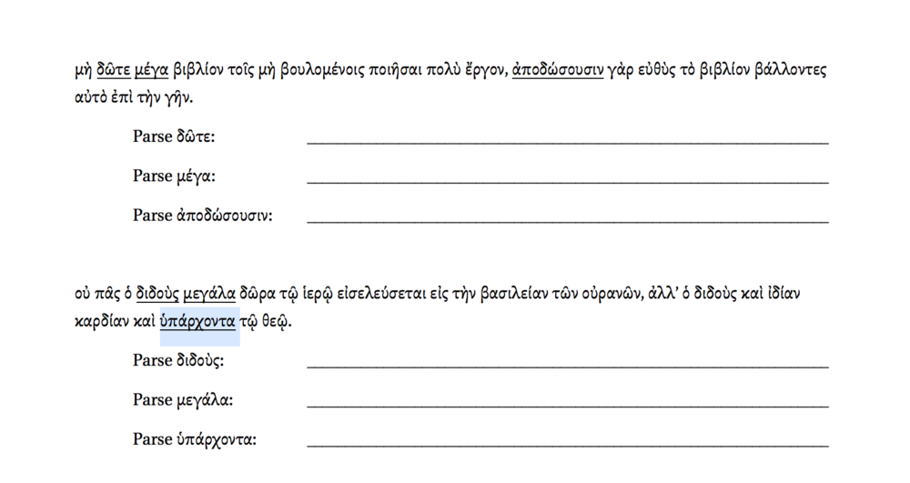
The only drawback to using Brill is that because it’s designed to be used for transliteration of all the classical languages the letter characters are a little smaller than what you see in a standard font like Times New Roman. The extra space for diacritics, however, leaves plenty of room for underlining a word without breaking too far into the Greek letters that extend below the line.