Zondervan is shipping the second edition of their Reader’s Greek and Hebrew Bible. It is a significant update that impacts my recommendation to some students regarding which edition of the Bible they should purchase.
The first edition of this work combined two reader’s texts into one volume: the second edition of Zondervan’s reader’s Greek New Testament and their reader’s Hebrew Bible. I used the first edition off and on for daily reading since it was released because I’ve always enjoyed having a reader’s HB and GNT bound together. I would, however, inevitably turn to another reader’s Bible primarily for typographical reasons. I never completely abandoned the first edition and always hoped they would improve the presentation. Let me explain.

History
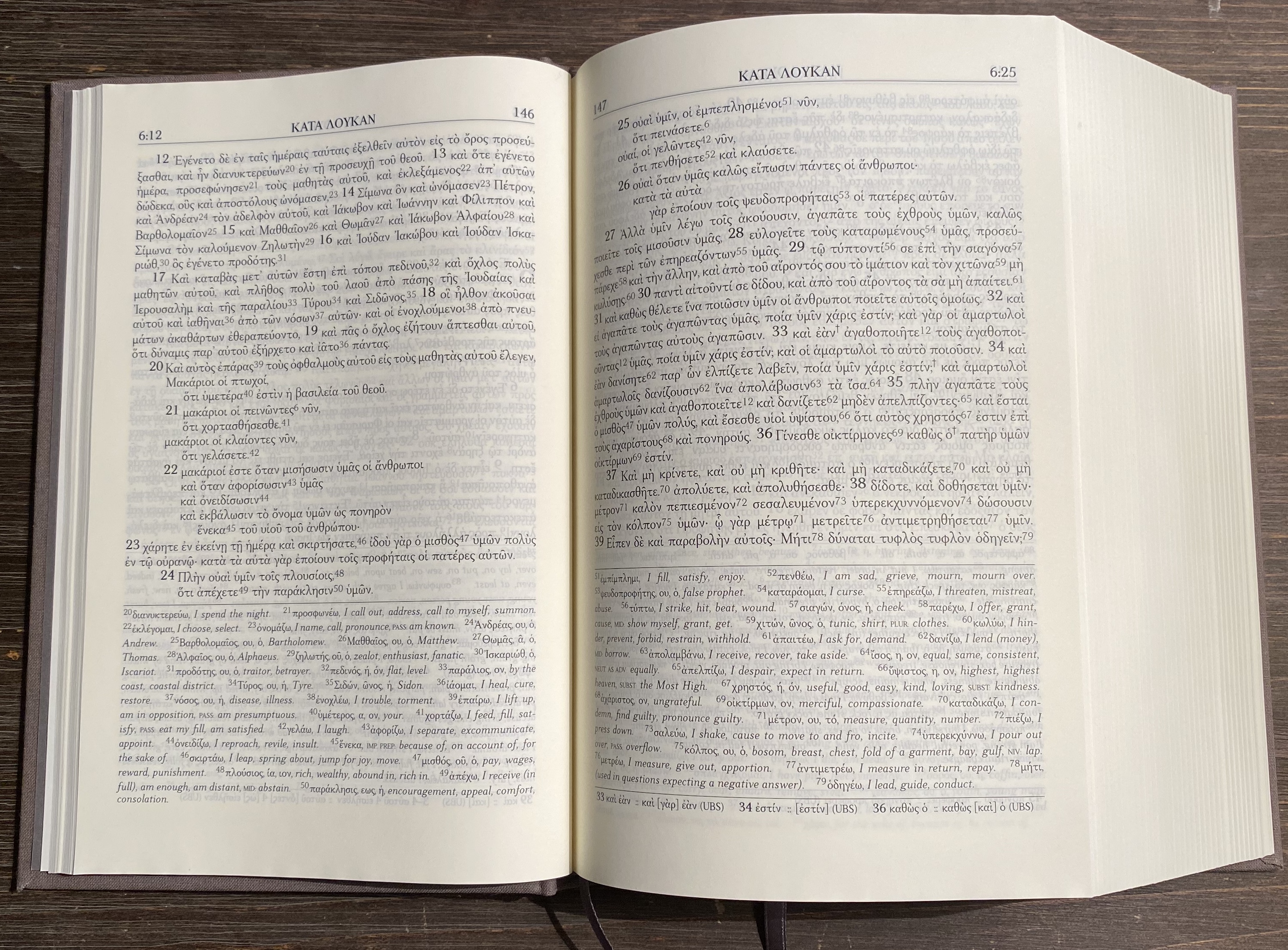
In 2004, Zondervan changed the game with the release of the first edition of their reader’s GNT. This was the very first reader’s Bible. Though it was well received and appreciated, there were always complaints about the font’s readability. It was small and slanted and crowded.
The second edition, relased in 2007, was a huge improvement, but in that same year UBS released a reader’s edition with larger, more readable font, and a two coloumn footnote layout. The text of the UBS edition also had the advantage of being that of UBS4, whereas the Zondervan text is reconstructed text based on the editorial decision of the committee behind the NIV. I don’t really care about the issue of what text is included, I just want the font to be easy on the eye.
The third edition of the Zondervan reader switched to their in house font, and it was again a big improvement. In some class settings this is the GNT edition I ordered for my students because it does such a good job balancing portability, readability, and affordability.
Unique Combination
Crossway’s publication of the Tyndale House GNT Reader’s Edition is the ultimate in presentation and readability, but it is the more concise presentation of Zondervan reader’s editions that allowed them to be published in one combined volume. The very features that keep them from being ideal standalone volumes makes them perfect in combination.
For the GNT, it’s the pragraph style formatting of the footnotes that saves a ton of space, in contrast to UBS/Hedrickson and Crossway’s two column footnote layout.
For the HB, it’s the fact that the Zondervan reader’s doesn’t parse every single verb, in contrast to the UBS/Hendrickson edition. Zondervan simply provides the lexical form, stem, and glosses.

Now, let’s take a look at how the second edition of Zondervan’s Reader’s Hebrew and Greek Bible has been improved apart from the inclusion of their latest reader’s GNT.
Hardback, Cloth
The first edition was published with a thin, flexible leather-like cover. It was nice in that it was able to lay across your lap easily, but it also felt cheap.

The second edition is bound with a sturdy, cloth hardback and feels premium. It reminds me of picking up the larger print version of BHS or Vetus Testamentum volume.

The hardback is sturdy, but it doesn’t add too much thickness. This second edition is only slightly thicker than the first edition, and though it includes both testaments it is about the same size as or slightly slimmer than the UBS/Hendrickson HB reader’s text.

Layflat Binding
Though this volume is over two thousand pages, it lays open easily even from the table of contents. With the first edition, the cover won’t lie open on its own. The second edition will.

When I first saw this edition announced and noticed there was no flexisoft cover option, I worried that the hardback would be too rigid and uncomfortable to hold. Whatever Zondervan is doing that warrants the description “layflat binding,” it works. My fears were unfounded.
Page Color
The first edition was printed on white paper. The paper of this edition has a slightly off-white tint similar to that of BHS. On the whole, I think this is indeed an upgrade, and it’s another feature that makes this edition feel more premium.

The page color doesn’t, however, fit quite as well with the way the HB portion handles proper nouns. The reader’s HB gives proper nouns that occur less than 100 times a grey font in contrast to the normal black. The font color tells the reader to keep moving. Just pronounce it and move on. The grey font doesn’t contrast quite as nicely with the off-white paper color, but I think the aesthetic benefit is worth it.
The paper color and the greyish-brownish cloth cover look great. That might sound silly, but it isn’t. Presentation matters. The way a book looks and feels impacts your motivation to pick up the book and read.
No Maps
The maps included in the first edition were handy, but I rarely used them. Furthermore, the inclusion of the maps between the two testaments made the volume feel like two independent volumes had been carelessly slapped together. Removing the maps is another factor that makes the volume feel more uniform and therefore more premium.
No Guilded Edges
The pages of the first edition were silver guilded. In my opinion it combined with the quality of the cover to make the volume feel cheap.

Each of the new features of this edition are an improvement, but there is still room for improvement in the next edition.
What’s Still Lacking
I would like to see Zondervan go even farther to unify the font size and formatting. The Greek font is still small and GNT pages crowded in comparison to that of the HB. If the HB font were slightly descreased and the GNT font slightly increased, perhaps the size of the volume could be maintained while improving the symmetry and presentation of each testament.

Bold Greek font appears in two places in the volume: in the GNT dictionary and in places where the GNT cites the HB. In these portions, the bold Greek font is actually much closer to the Hebrew font weight. The asymmetry isn’t just an issue of font size but also font weight.

The Hebrew Bible uses the old non-unicode BibleWorks font. If Zondervan doesn’t produce their own Hebrew font, perhaps they could use Times New Roman or Frank Ruehl, something closer in weight to that of their Greek font. It would be even better if they could increase the weight of their Greek font slightly and find a Hebrew font that is similar to BibleWorks or only a little less heavily weighted.
Finally, it would be nice if the headings, verse references, and other annotations were unified with the same font type, size, and weight. The reader’s editions are great; I would just love to see the presentation of the next edition continue to improve the symmetry and readability.
Conclusion
I’m thrilled with this new edition and happy to recommend it to anyone who is learning Hebrew and has already studied Greek or vice versa. The Tyndale House GNT Reader’s Edition is what I recommend for those learning Greek as their first biblical language, but once you add Hebrew to the mix, the Zondervan’s Reader’s Hebrew and Greek Bible Second Edition is the next purchase. I look forward to using this edition as my primary reading text this summer.

