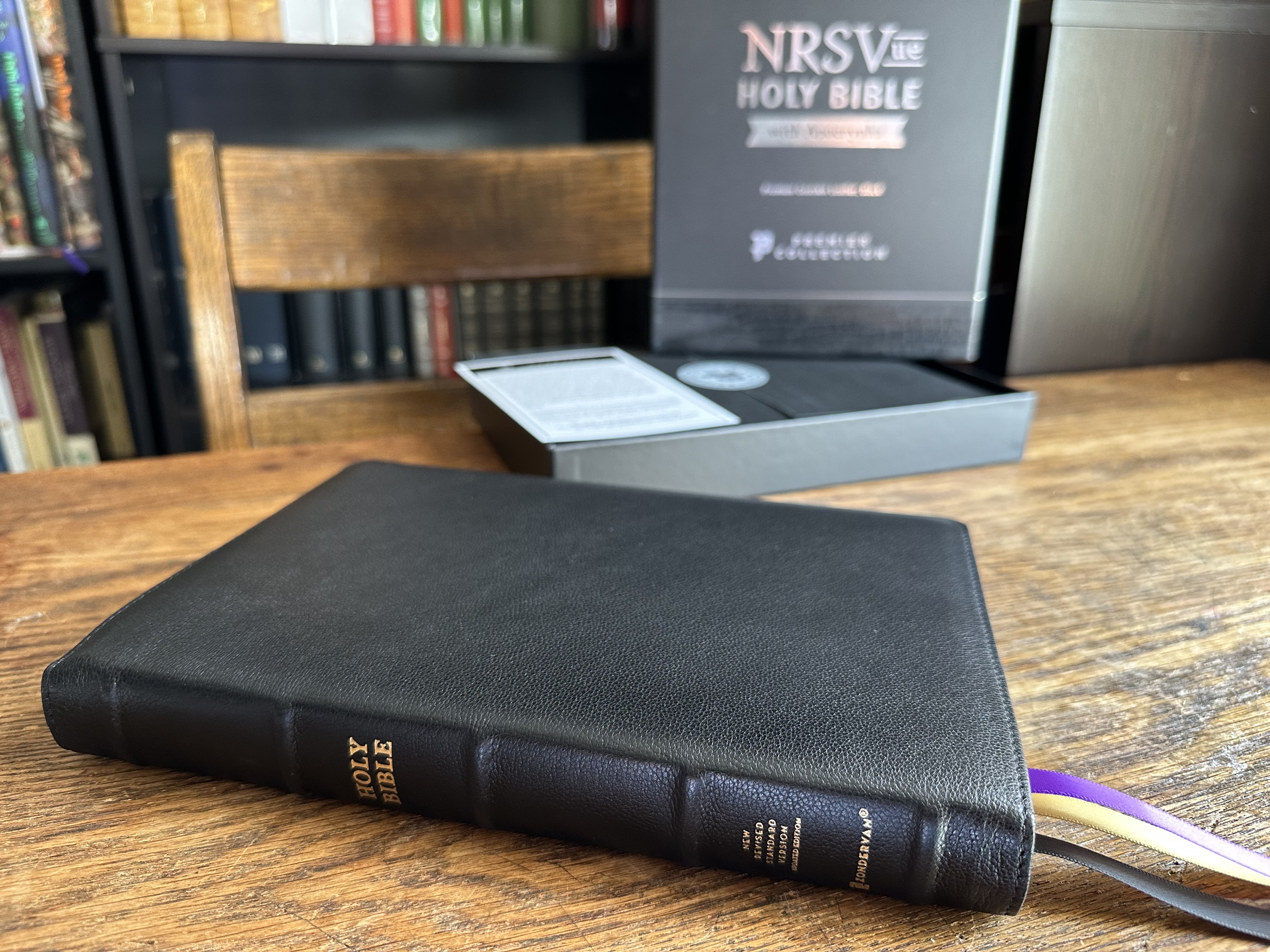
Zondervan recently published a gorgeous NRSV Updated Edition (NRSVue) in their Premier Collection. I really like this Bible, and in this post I want to show you why. Here are the details of the edition I’m reviewing:
- Includes the Old Testament, Apocrypha, & New Testament
- Hand bound with black goat skin
- Smyth-sewn and edge lined
- Five raised spine hubs
- Three double-sided satin ribbons
- 36 GSM premium European paper
- 10-point Zondervan NRSVue Comfort Print Typeface designed by 2K Denmark
- All black text
- ISBN 9780310461500
TL;DR
I highly recommend this Bible for a number of reasons: The 10-point, custom typeface is beautiful, bold, and easy to read. The goatskin cover is soft and durable. The raised spin hubs are a delight to the eye and feel great when holding the Bible with one hand. There is hardly any bleed through or ghosting on the pages, and the purple under gold art gilding gives the Bible a royal aesthetic fitting for Holy Scripture.
Let’s take a look at some of these features.
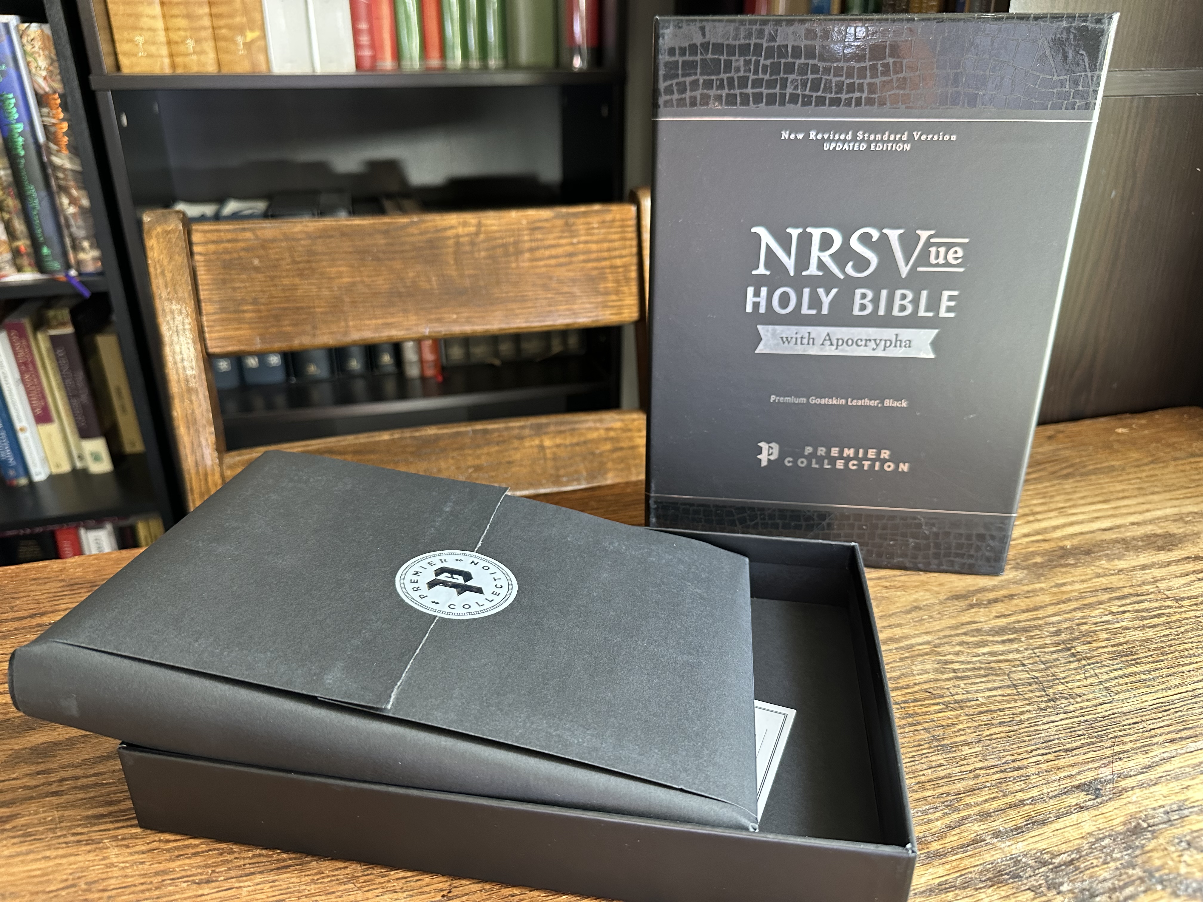
Packaging
It is a joy to unpack one of Zondervan’s Premier collection Bibles.
I couldn’t bring myself to break their Premier Collection seal and so I took a tip from Tim Wildsmith, slipping the Bible out the side of the wrapping.
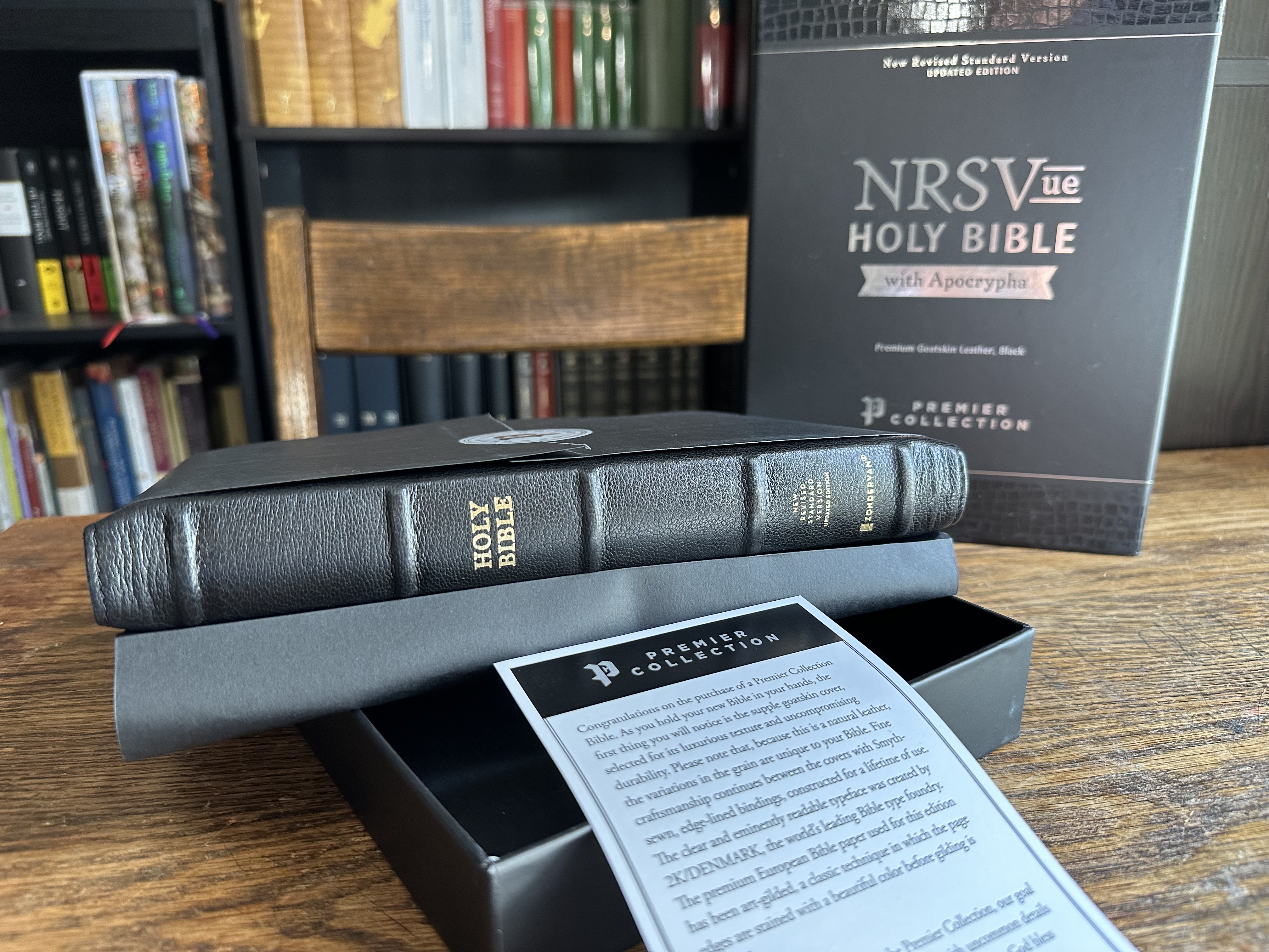
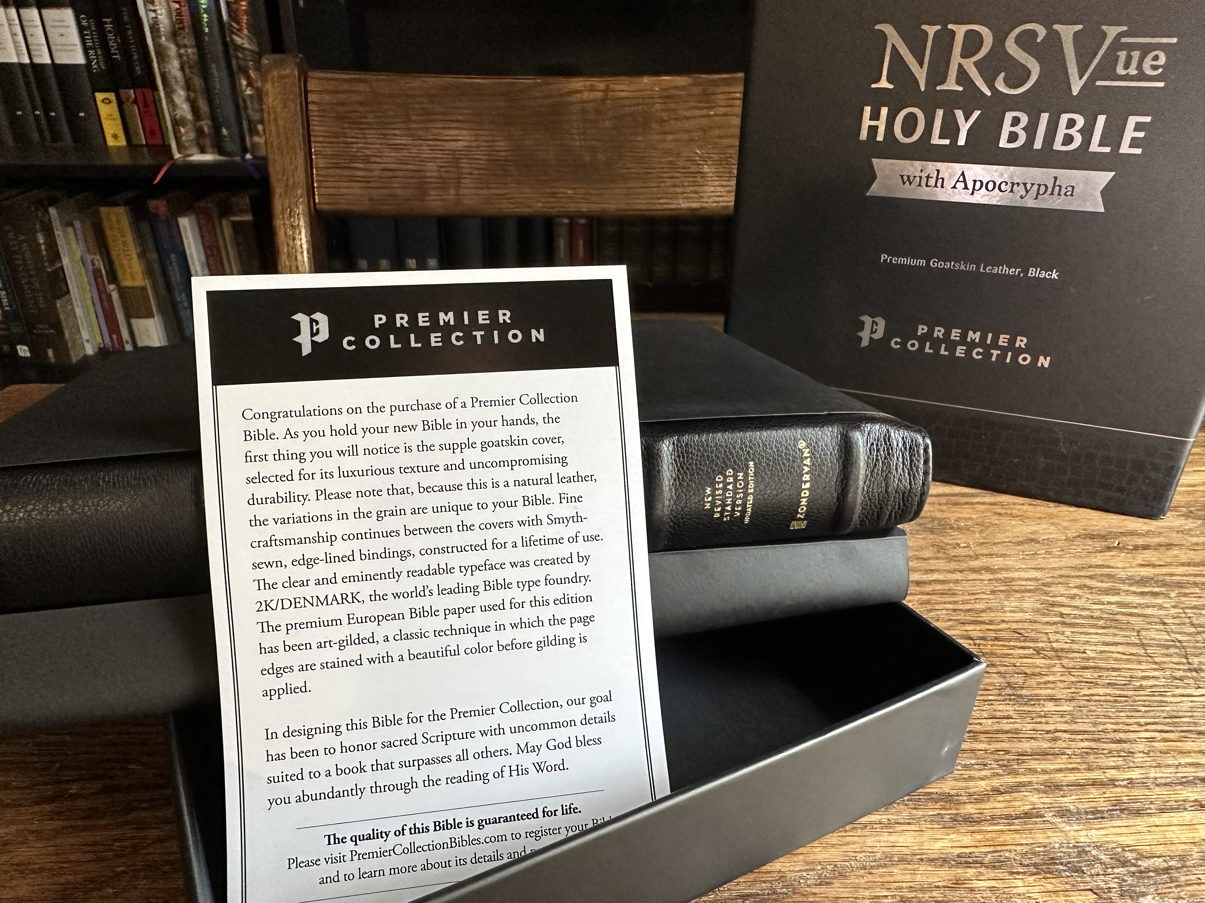
The enclosed note overviews the craftsmanship and states, “The quality of this Bible is guaranteed for life.”
Cover
This is my second Premier Collection Bible, and three things immediately stand out with this edition. My NIV Premier Collection didn’t include spine hubs, and the spine hubs on this NRSVue are stunning.
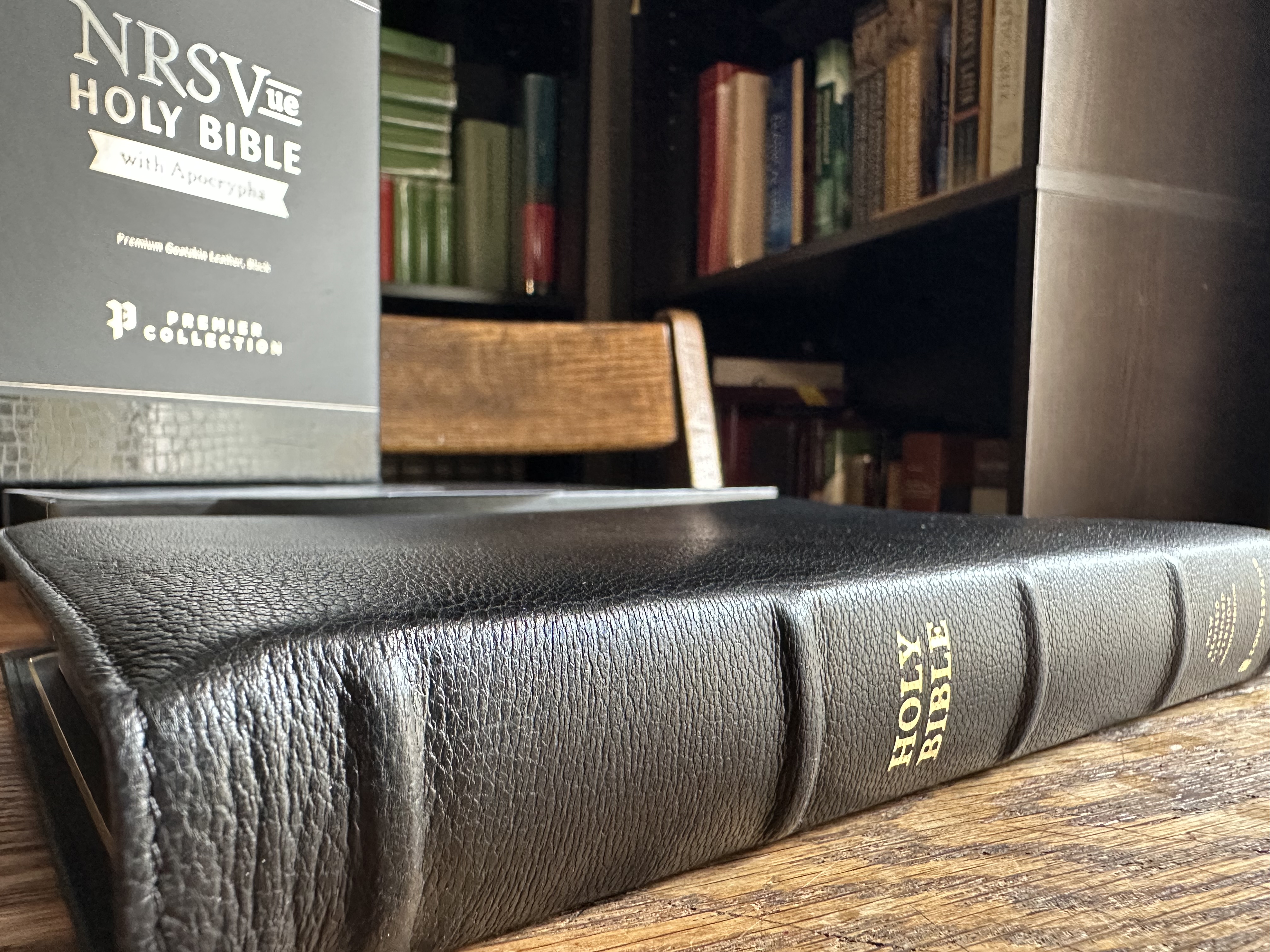
Second, both ends of the spine have a bit of a taper that I think looks great. Third, the goat skin on this edition is softer and more plush than other Premier Collection Bibles I have held.
Edge Lined
The Smyth-sewn, edge lined construction means this edition of the NRSVue is a true “floppy Bible,” and I love that about it.
It lays open effortlessly.
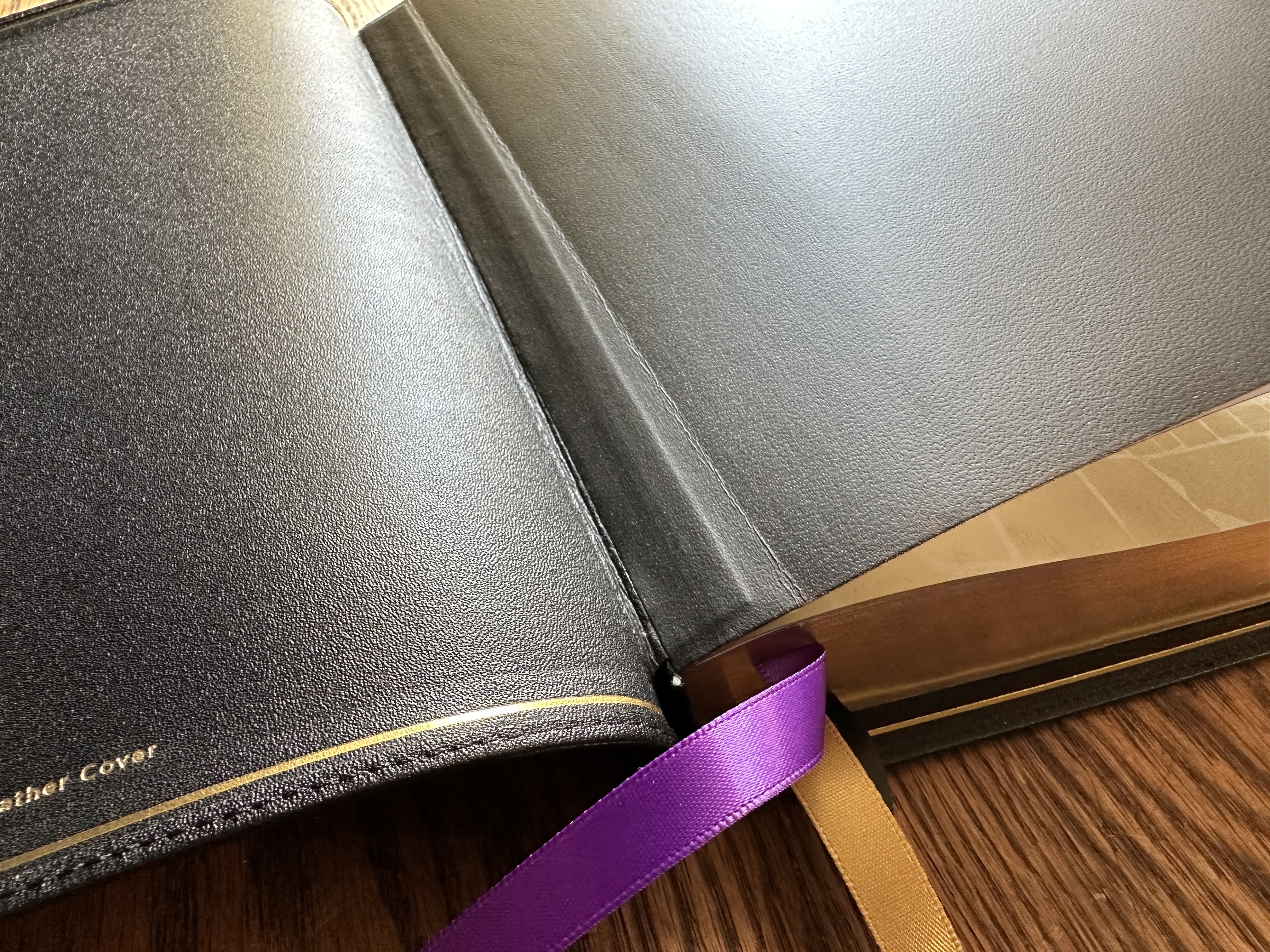
Ribbons
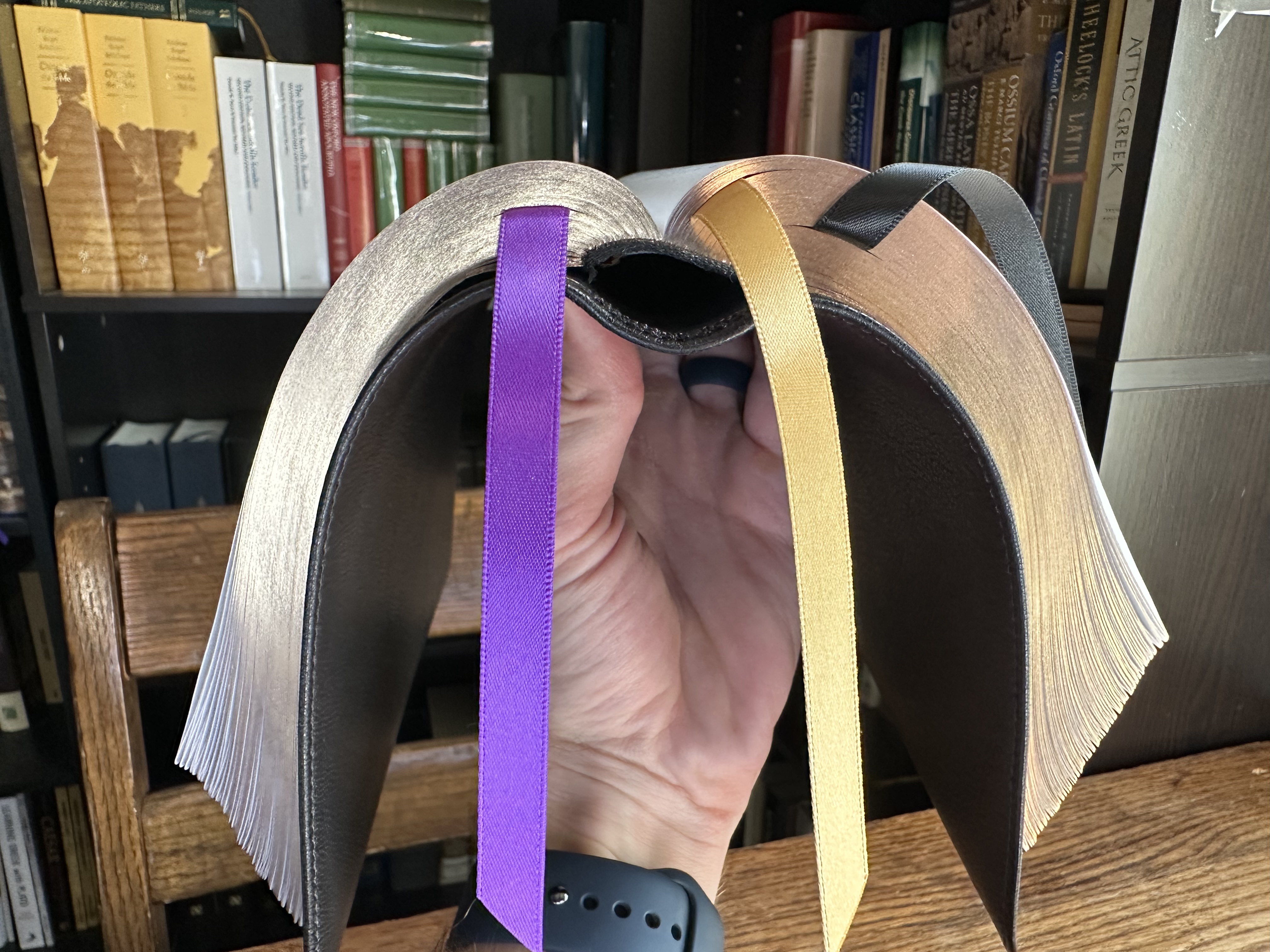
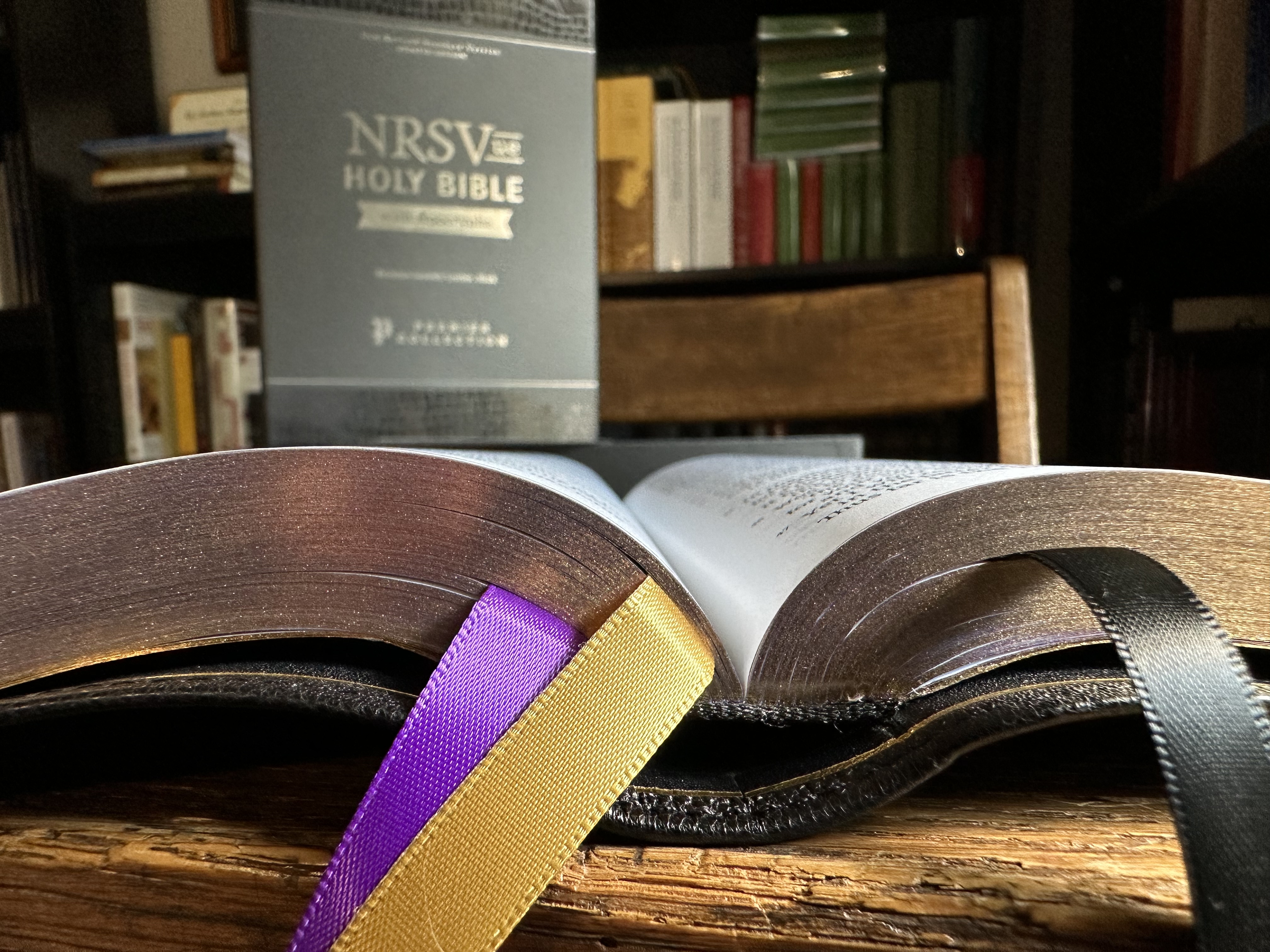
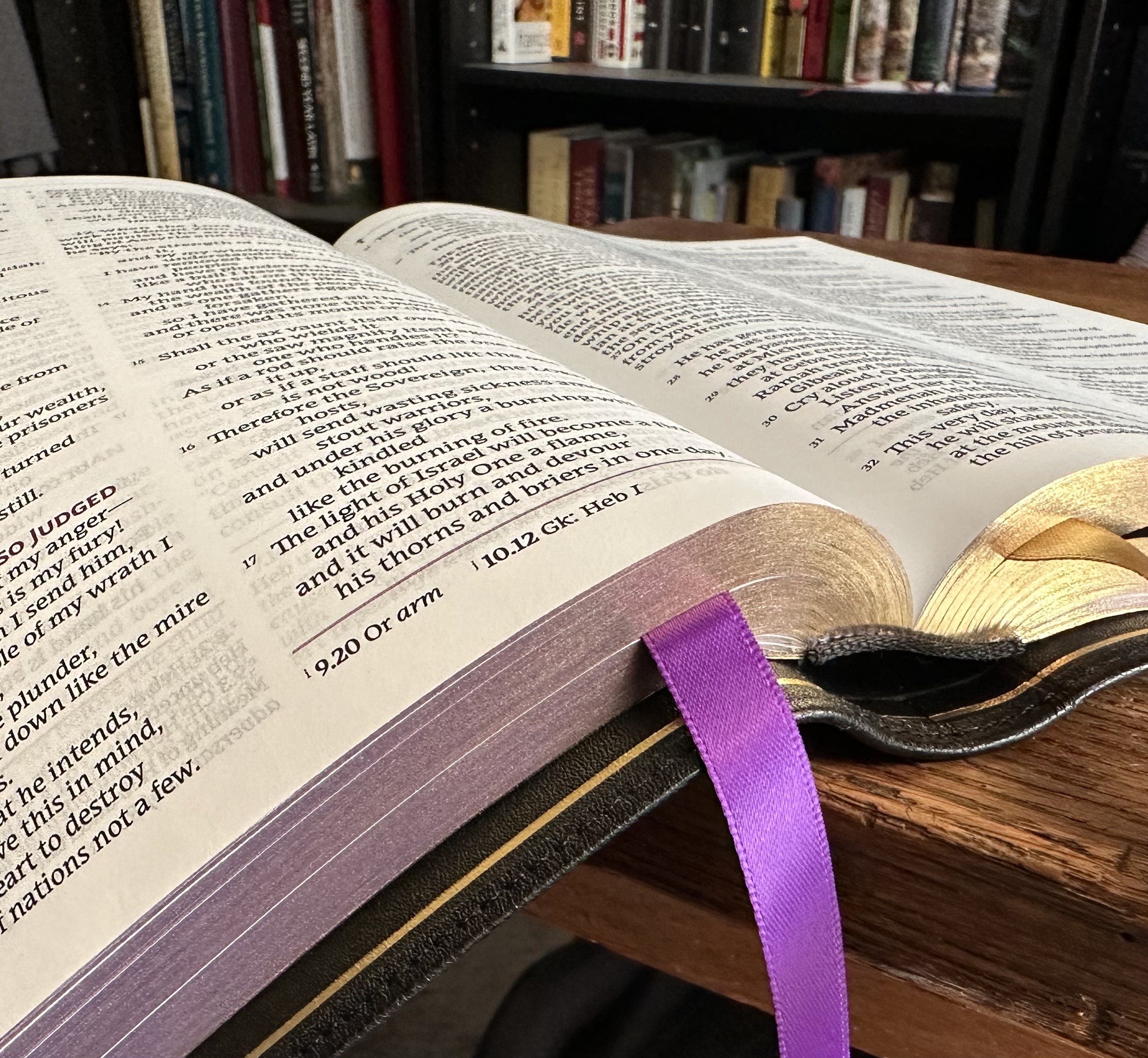
This edition includes three double-sided satin ribbon markers, each 3/8-inch wide.
The gold ribbon is an interesting color choice. I might have preferred red in combination with the purple and black, but the purple and gold ribbons match the purple under gold art gilding. I appreciate the symmetry in these color choices.
Art Gilding
I think the purple art gilding is beautiful.
The purple under gold is a combination I needed to see to appreciate. I love it. You can see the gold here:
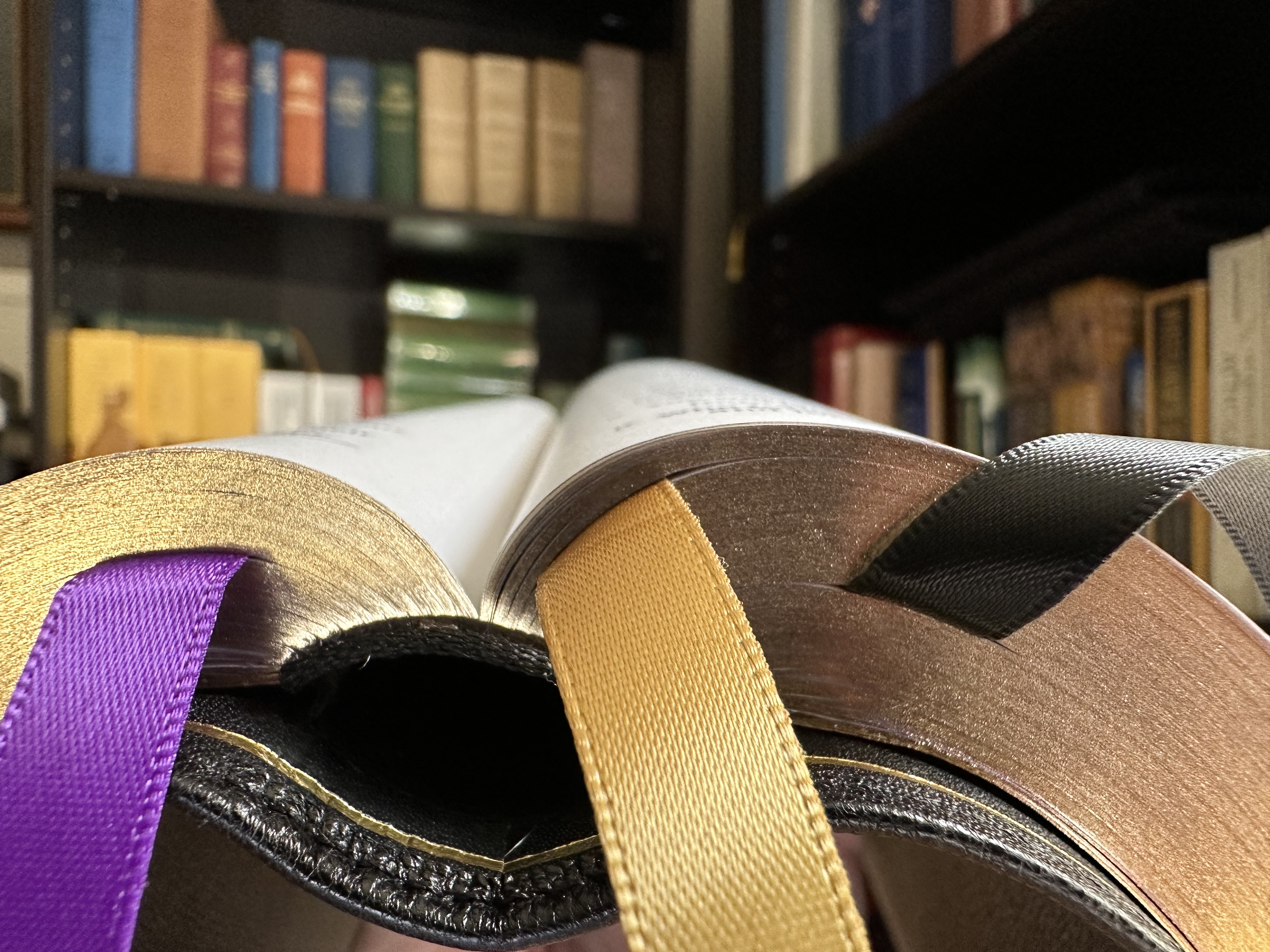
It’s not easy to capture the rich, deep purple art gilding in a picture, but you can see a bit of it here.
You might not notice it unless you look closely, but the purple art gilding has just a little speckle in its appearance, giving it a custom, hand crafted look.
You can see a bit of both the gold and purple here:
Typeface
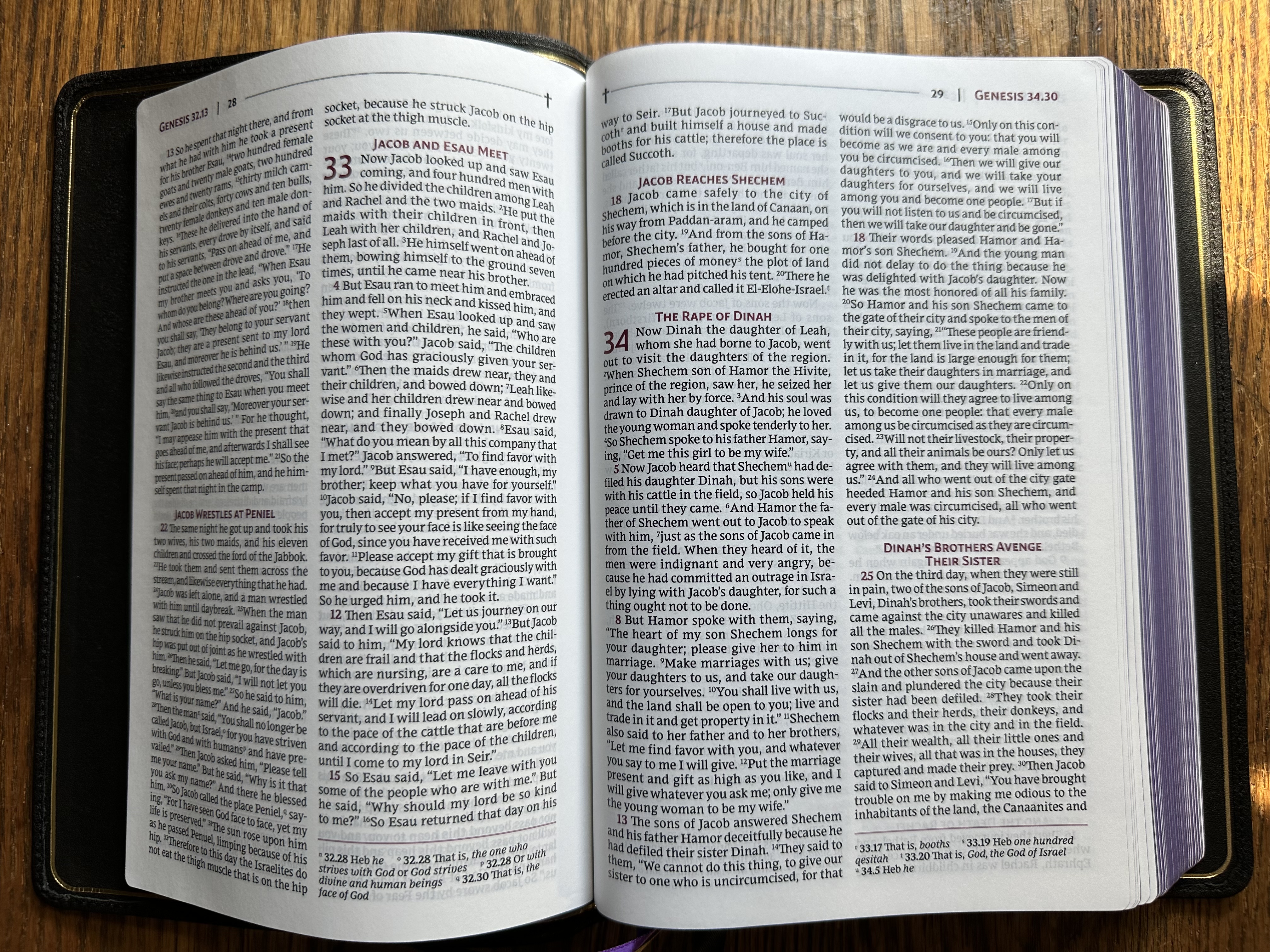
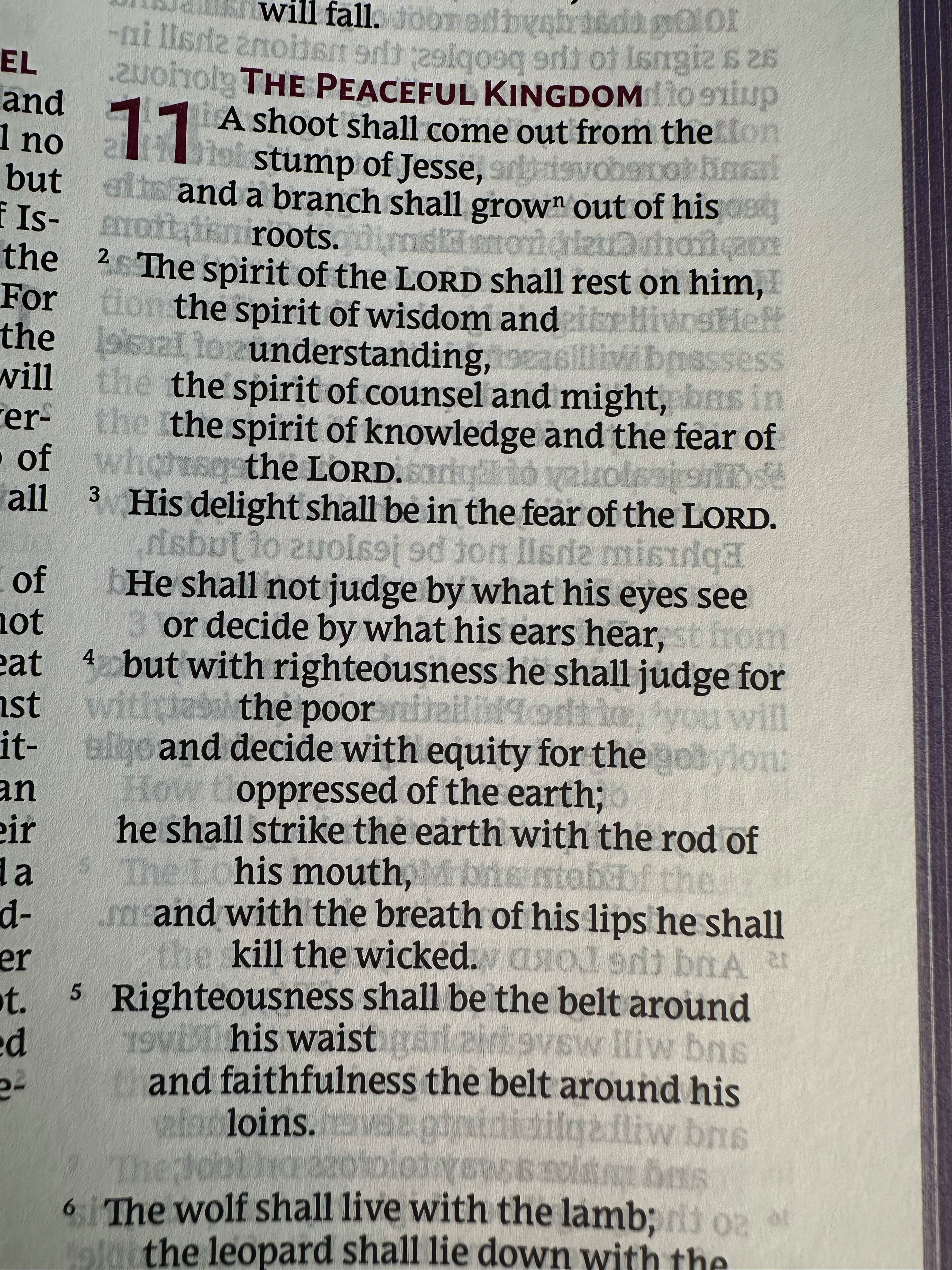
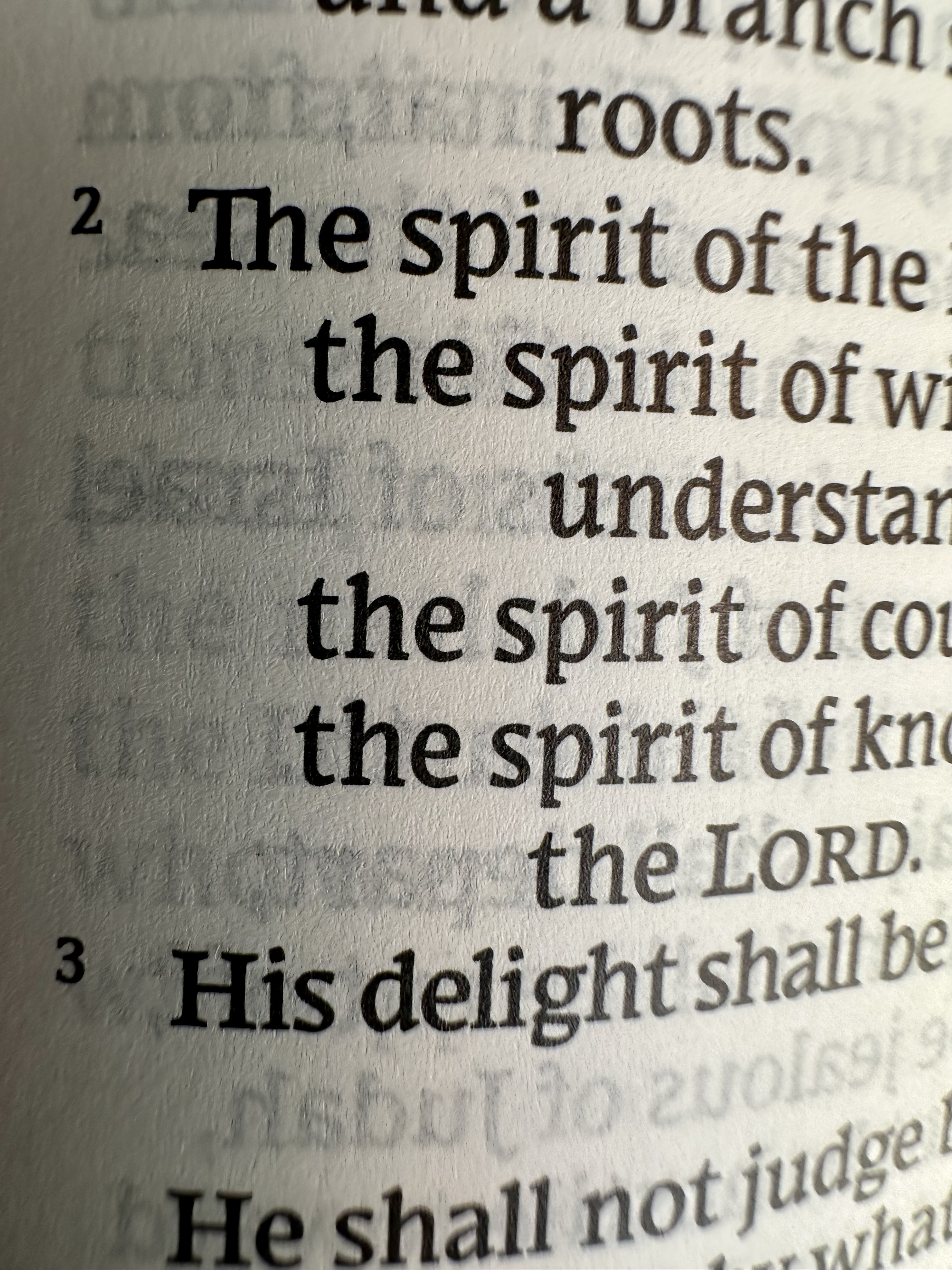
The Comfort Print NRSVue typeface from 2K Denmark is bold and easy to read.
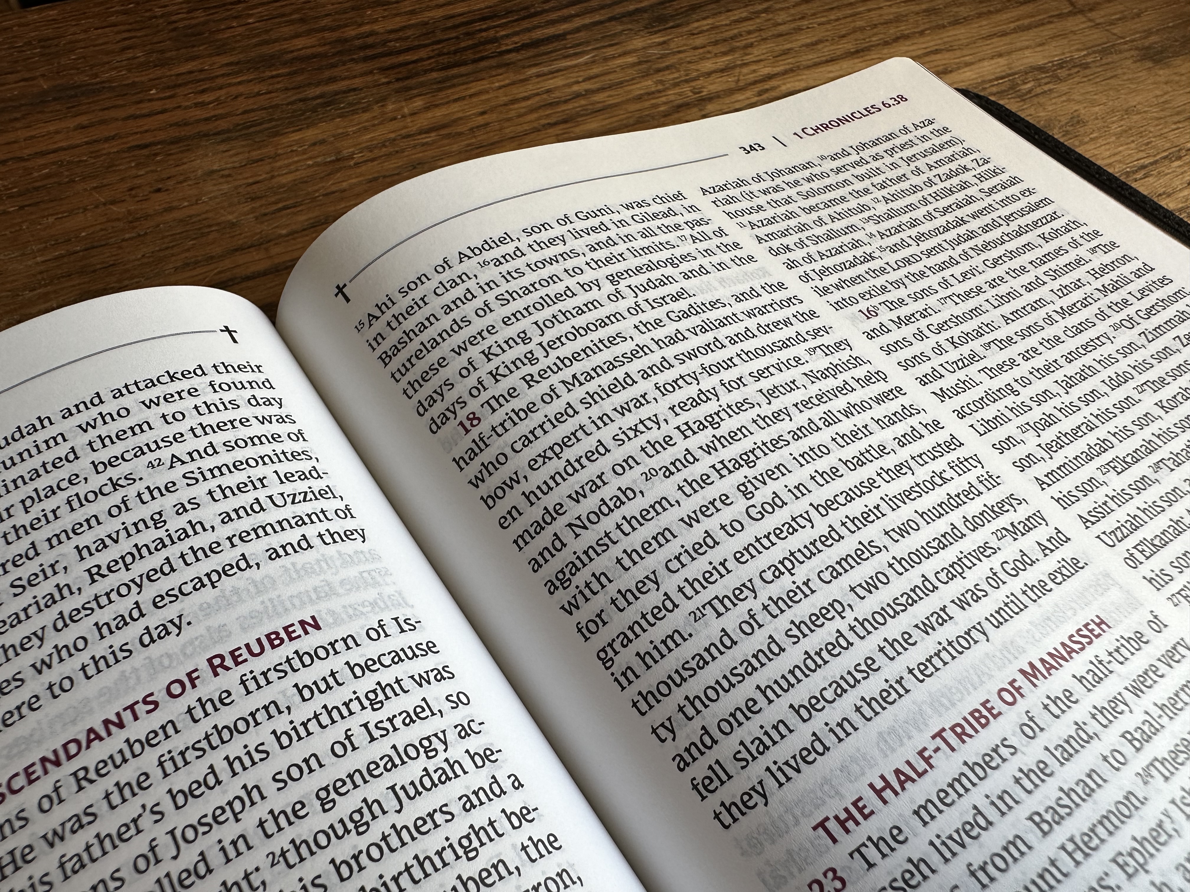
The font is listed as 10-point, but to me it reads larger because of how heavy the weight of the font is.
I really appreciate the letter design. I like how the curves on rounded portions of letters like d and p have been given just a bit of a point. You can see what I mean here:
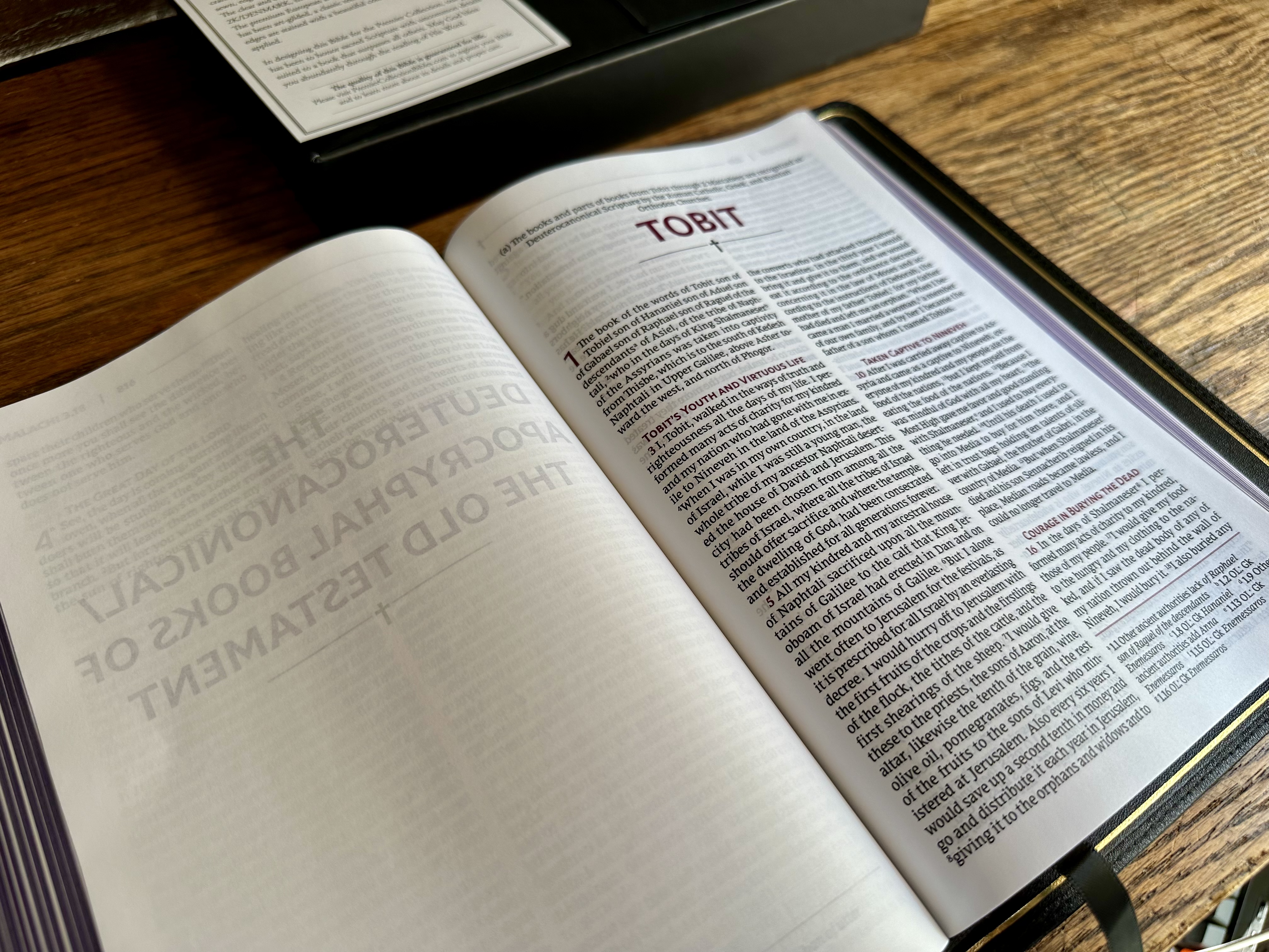
Apocrypha
I’m happy to see the Apocrypha is included in this Premier Collection Bible.
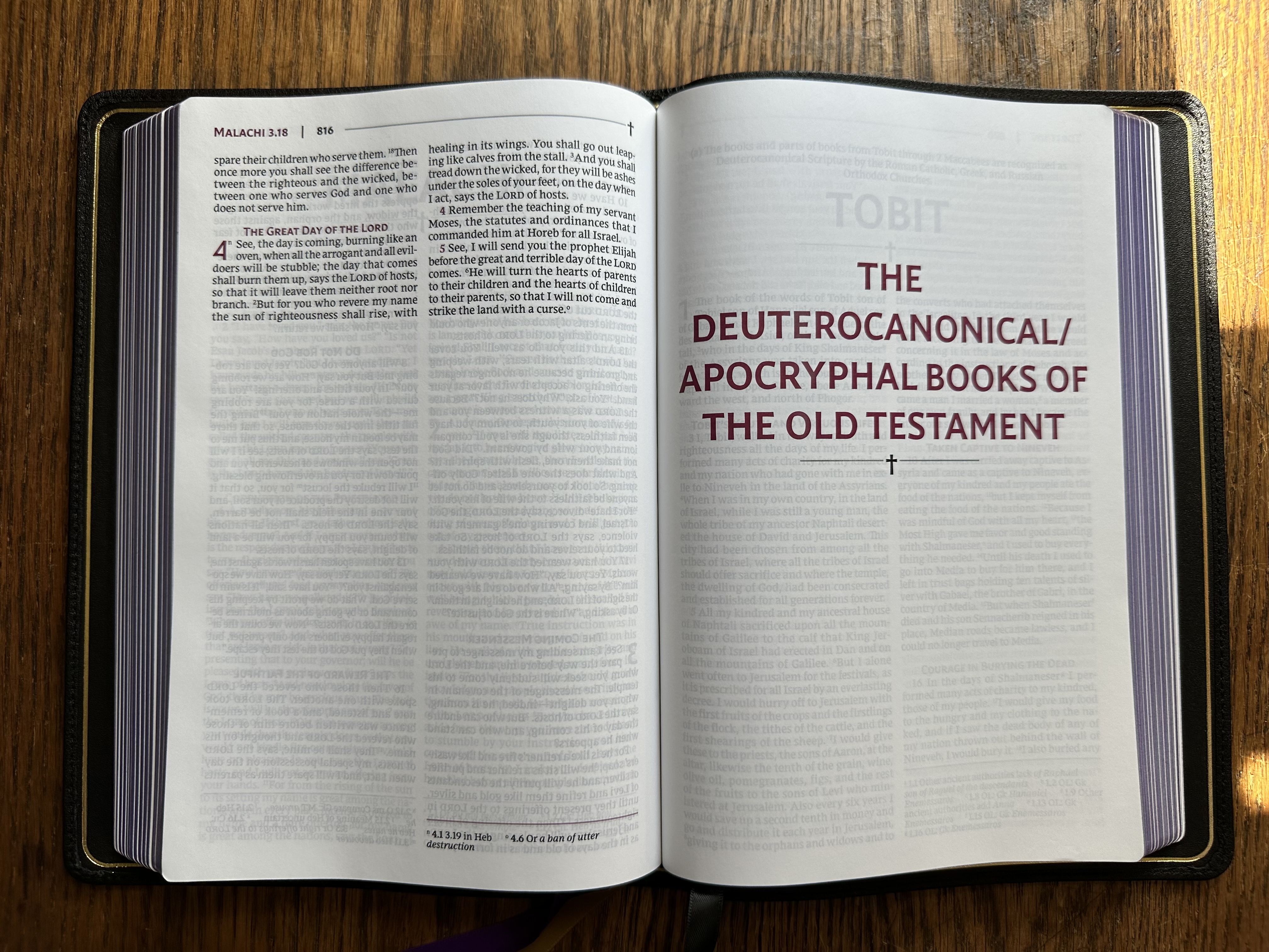
If you are looking for a premium Bible that includes the Apocrypha, this edition is ideal.
Additional features
The two-column format is my preferred layout. I find it easier to keep my place when my eye moves from the end of one line to the beginning of next line.
One interesting, perhaps controversial design choice is the inclusion of a cross on every page of the Bible. As a Christian, I like the visual reminder that we read all scripture with reference to Jesus, but it is a bit odd in light of the way the NRSV has served as the default translation in such varied academic contexts.
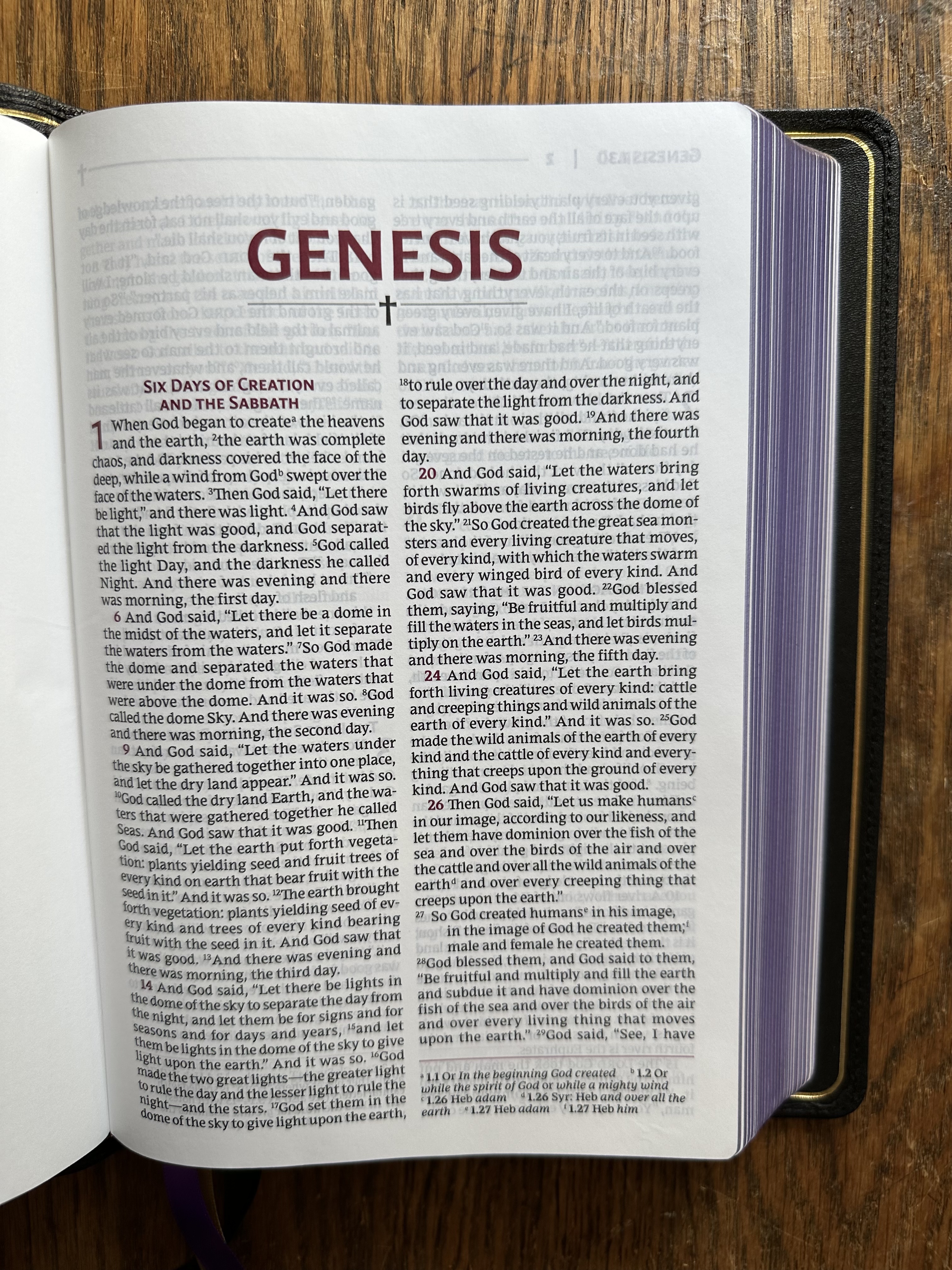
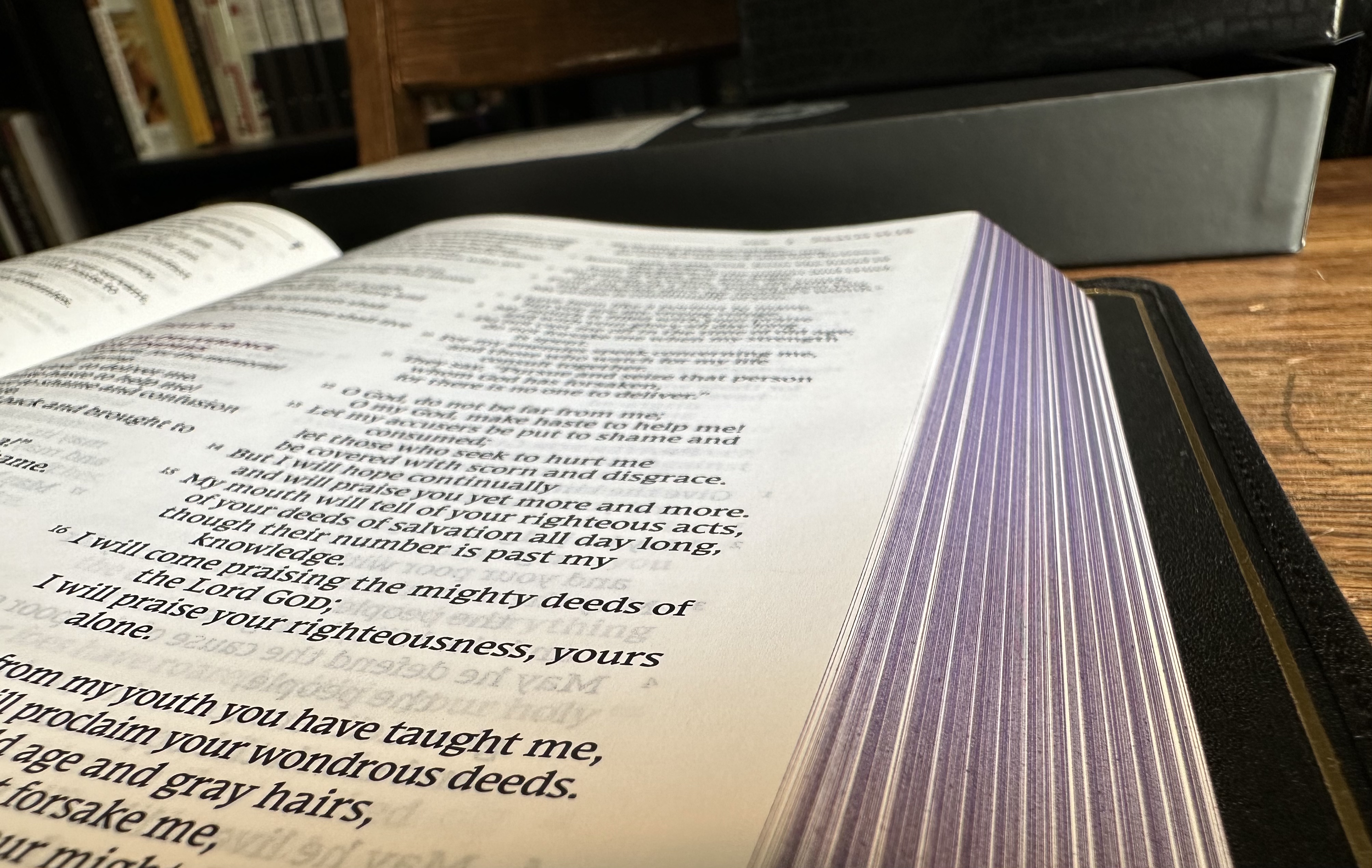
The 36 GSM paper has just the slightest bit of a textured feel, not grainy but definitely not glossy or silky smooth. It’s a texture that I really like.

There are no cross references in this edition, which helps it maintain a thin profile despite the additional thickness required by the inclusion of the Apocrypha.
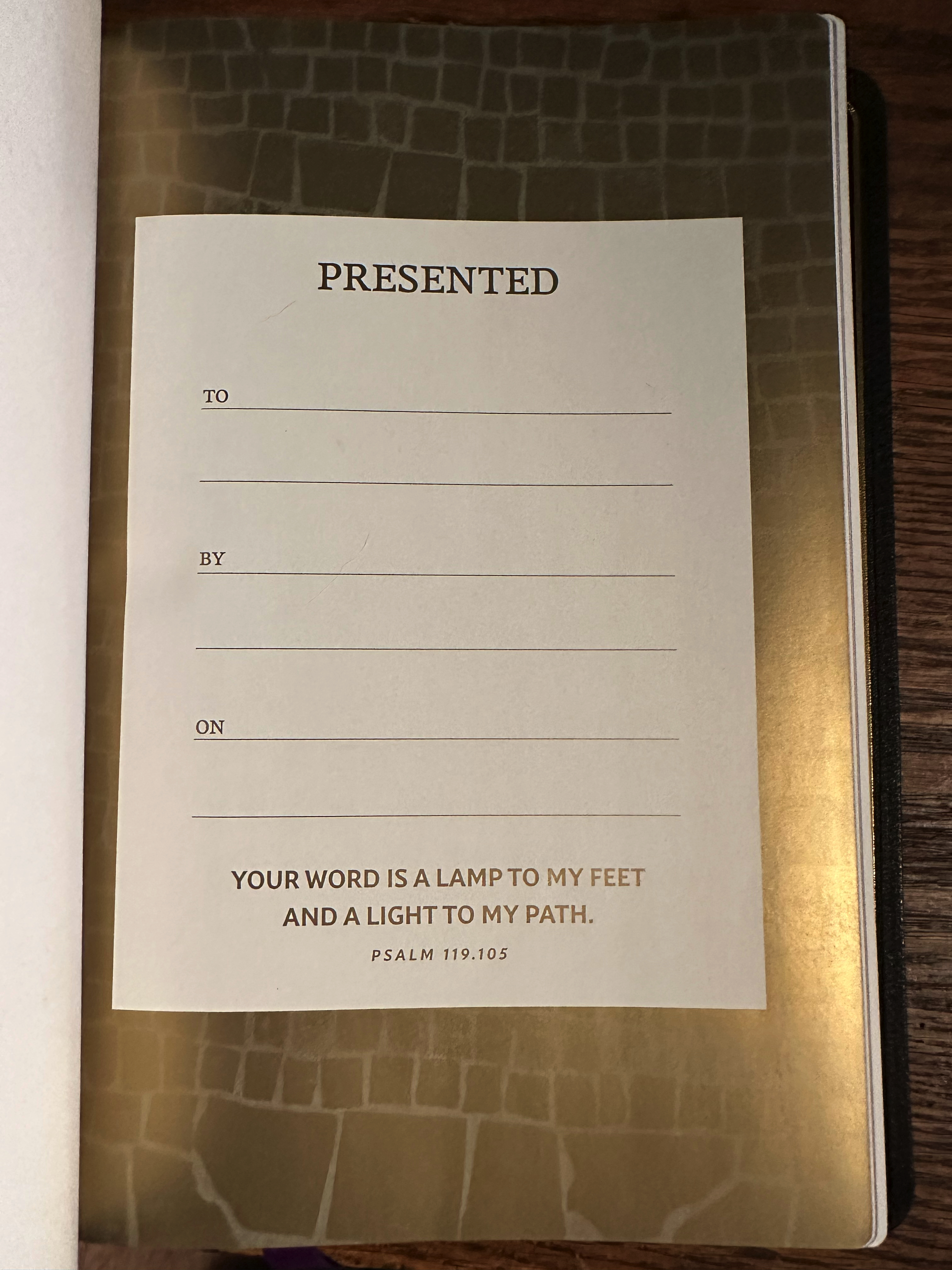
One minor quibble with the design: The presentation page is gaudy and just plain ugly. A Bible of this quality deserves something more minimal and refined in my opinion.
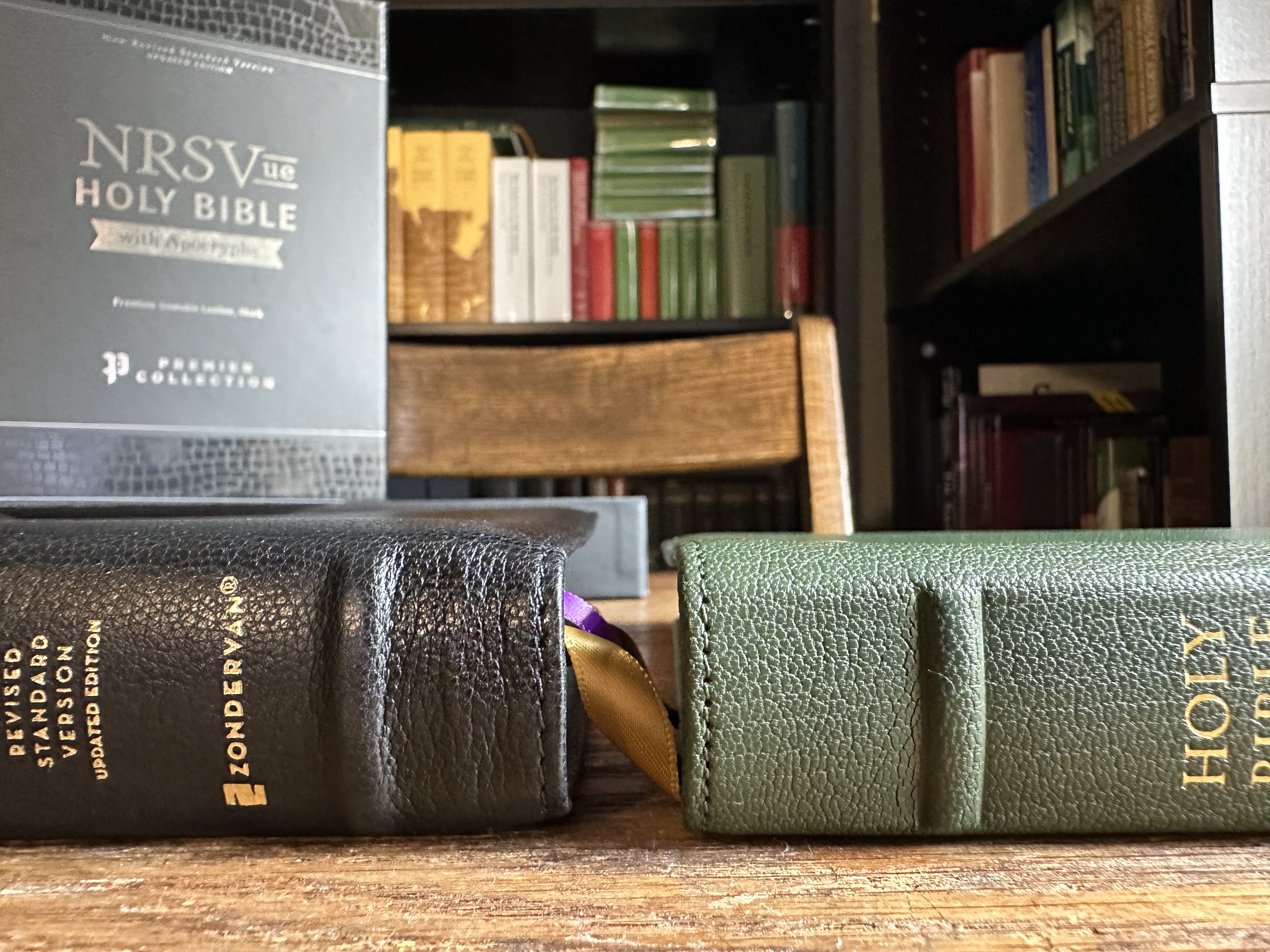
Size and Comparison with Crossway’s ESV Heirloom Omega Edition
Zondervan lists the size of this Bible as 7.75(h) x 10.88(w) x 1.63(d) inches. The weight is 3 pounds. I thought it might be more helpful, however, to compare it to another very popular premium Bible, Crossway’s ESV Heirloom Omega Edition.
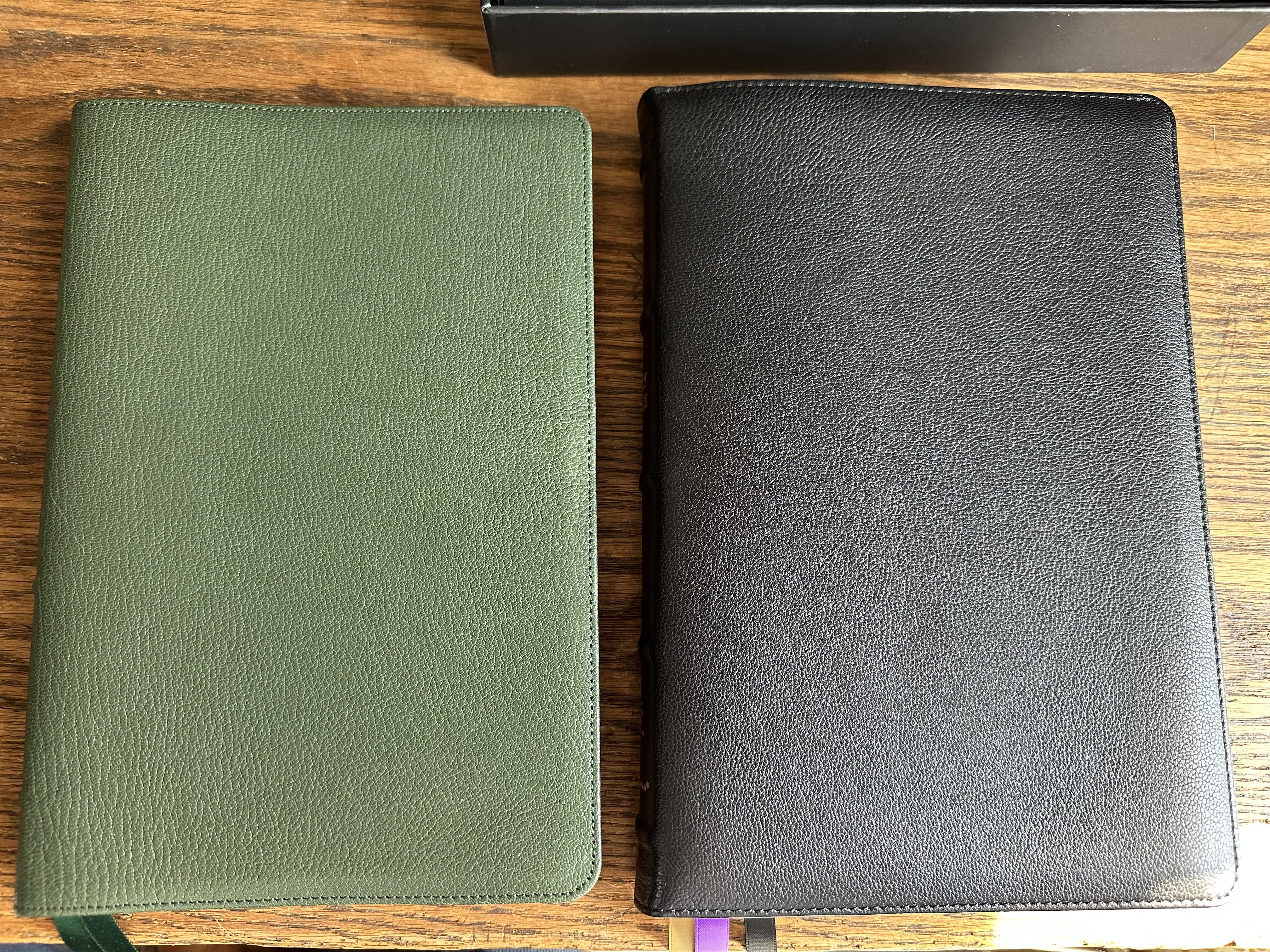
As you can see, the footprint of these footprint of these two Bibles is very similar. Because the NRSVue Premier Collection includes the Apocrypha, it is just a little thicker and heavier.
Conclusion
I highly recommend Zondervan’s Premier Collection NRSVue to anyone in the market for a NRSVue Bible. It’s a gorgeous Bible that strikes a great balance between portability and readability. I look forward to reading through this edition and reporting back on how it holds up over the next year.
Currently, HarperCollins is selling this edition for 50% off. At just over $100, the current sale is a steal.
Thanks to Zondervan for sending me this Bible for review.
